Preview image. Unlock full-res
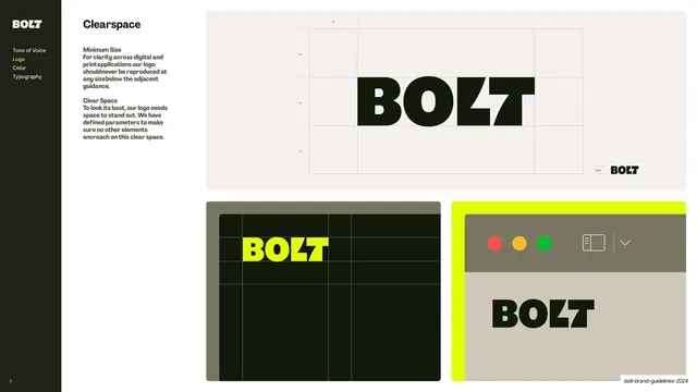
Sidebar-nav slide with a clearspace measurement diagram and two application mockups showing the logo in a UI and on a billboard grid.
Summary
The clearspace and minimum-size page: a measured construction diagram over a top panel, with two application mockups showing the spacing rule in use.
Visual description
A content slide with the dark sidebar (Logo highlighted yellow) and two short blocks of copy headed "Minimum Size" and "Clear Space". The right side stacks three panels. The large top panel sits on warm off-white and shows the BOLT mark inside a faint "1x" measurement grid marking the clearance on every side, with a small "30pt" minimum-size note. Below, two smaller panels: one near-black with the yellow BOLT and the same clearspace grid in dashed lines, and one with a window-chrome UI mockup (red/amber/green dots and a sidebar icon) over warm grey with the black BOLT placed below.
Key takeaway
Showing the abstract clearspace grid and then immediately repeating it inside two believable applications (a dark layout and an app window), so the measurement rule is proven in context rather than left theoretical.
Reuse notes
A reusable clearspace-and-minimum-size page. The move of overlaying the same measurement grid on real mockups is what makes spacing rules stick. Standard companion to the logo-color and misuse pages in any guideline.
From this deck: Logo clearspace and minimum size
View deck




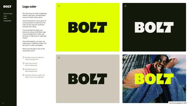

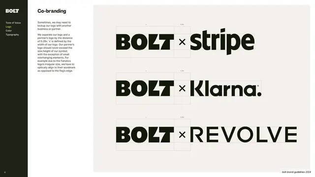
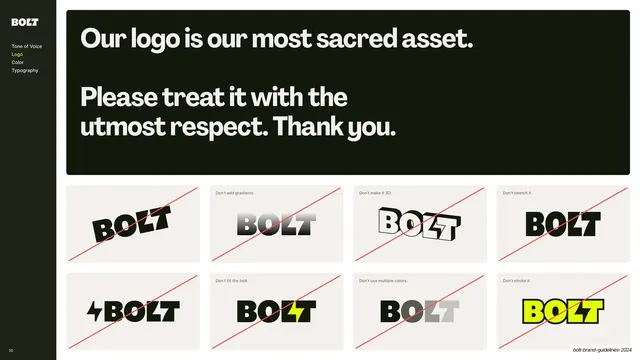






More like this








Keep what you find
A free account saves references to boards and can send you a weekly email of picks based on what you save.
To see every result, go Pro.