Preview image. Unlock full-res
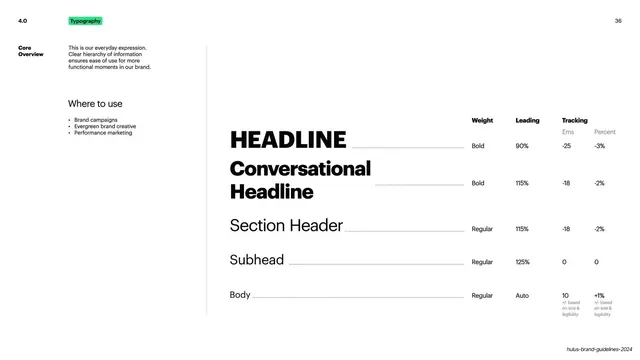
Light slide laying out the Core type scale from Headline to Body with a weight, leading and tracking spec table.
Summary
The Core type-scale page: a descending hierarchy from Headline to Body, each row paired with its weight, leading and tracking values in a spec table.
Visual description
White ground split by a thin vertical rule. Top-left: "4.0" number and green "Typography" pill; "36" top-right. Left column under "Core Overview" gives a short intro about clear hierarchy and a "Where to use" list (Brand campaigns, Evergreen brand creative, Performance marketing). The right two-thirds is a live type scale set in descending size: a bold "HEADLINE," a bold two-line "Conversational Headline," "Section Header," "Subhead," and "Body," each connected by a dotted leader line to a right-hand spec table with columns Weight, Leading, and Tracking (split into Ems and Percent). Sample values run from Headline (Bold, 90% leading, -25 ems / -3%) down to Body (Regular, Auto leading, 10 ems / +1%, with fine print noting adjustments based on size and legibility).
Key takeaway
Showing the type hierarchy as living specimens at true relative scale, each tied by a dotted leader to an exact weight/leading/tracking row, so designers see the look and the numbers together. Splitting tracking into ems and percent is a precise, implementation-ready touch.
Reuse notes
A directly reusable type-scale spec layout for brand guidelines or design systems. The specimen-plus-table-with-leaders pattern is copy-ready; extend it with caption and label rows as needed. Keep the leaders aligned so the eye connects each sample to its values.
From this deck: Hulu Core type hierarchy scale
View deck

























More like this
Keep what you find
A free account saves references to boards and can send you a weekly email of picks based on what you save.
To see every result, go Pro.