Preview image. Unlock full-res
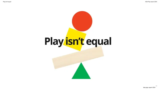
Section title in black across the center of a stacked, precariously balanced tower of primary-color shapes on a wood-grain plank.
Summary
A section divider that turns the brand shapes into a visual pun: a precarious balancing tower of a red circle, a tilted yellow square and a wood-grain plank perched on a green triangle, with the section title "Play isn't equal" running in black across the middle.
Visual description
A white field with the brand shapes stacked vertically at center into a wobbly tower: a red circle on top, a tilted yellow square below it, then a long pale wood-grain plank balanced like a seesaw on the point of a green triangle at the bottom. The headline "Play isn't equal" is set large in black sans-serif horizontally across the slide, overlapping the yellow square at its center.
Key takeaway
Composing the brand shapes into an unstable, balancing stack to literally illustrate the section theme ("not equal" = off-balance). It turns a plain divider into a one-image metaphor using only the existing shape kit, no new illustration.
Reuse notes
A clever divider move when a section title can be expressed as a physical metaphor (balance, tipping, stacking). Reusable for themes about fairness, equilibrium, or instability. Works because the shape language is already established; introduced cold it would read as random.