Preview image. Unlock full-res
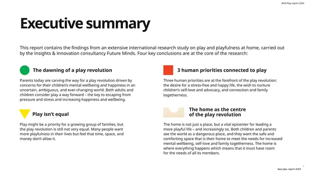
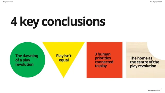
Executive summary on white, with four key conclusions each flagged by a small primary-color shape in a 2x2 grid.
Summary
The executive summary: a black headline and a lead paragraph over white, then the report's four key conclusions laid out in a 2x2 grid, each headed by a small primary-color shape that doubles as a section icon.
Visual description
White ground. "Executive summary" in oversized black sans-serif top-left, with one wide intro line beneath naming the research study. Below, four blocks in a two-by-two arrangement, each opening with a small flat shape: a green circle ("The dawning of a play revolution"), a red square ("3 human priorities connected to play"), a yellow downward triangle ("Play isn't equal"), and a small wood-grain notched shape ("The home as the centre of the play revolution"). Each shape is followed by a bold sub-head and a short paragraph of body copy. A small "IKEA Play report 2024" caption sits top-right.
Key takeaway
Using the four primary-color shapes as both decorative markers and a consistent index: each shape is permanently tied to one of the four themes and reappears later in the deck, so the summary quietly teaches the reader the deck's color-coding before they hit the sections.
Reuse notes
A reusable "key takeaways" or executive-summary layout for reports. The shape-per-theme system is worth copying when a deck has a fixed small number of recurring sections; it gives instant wayfinding. Keep the shapes flat and the palette tight or the coding loses its clarity.
From this deck: Executive summary with four colored markers
View deck

















More like this







Keep what you find
A free account saves references to boards and can send you a weekly email of picks based on what you save.
To see every result, go Pro.