Preview image. Unlock full-res
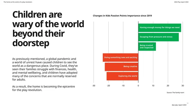
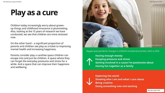
Large black headline and copy on the left, with a diverging horizontal bar chart on the right showing rising priorities in green and falling ones in red around a zero axis.
Summary
A data slide: a four-line black headline and two paragraphs on the left, with a proper diverging horizontal bar chart on the right plotting changes in children's passion points since 2019, positives in green to the right and negatives in red to the left of a central zero axis.
Visual description
White ground. "Children are wary of the world beyond their doorstep" in four lines of oversized black sans-serif fills the left, with two paragraphs on the pandemic-driven shift and the home as epicenter. The right half is a labeled diverging bar chart titled "Changes in Kids Passion Points Importance since 2019," with a horizontal axis from -30 to 30. Three green bars extend right (Having enough money, Escaping pressure and stress, Being trusted and respected) and three red bars extend left (Doing something new and exciting, Being creative, Exploring the world), each labeled in white inside the bar. A "Source: The Family room" credit sits low.
Key takeaway
Using a genuine diverging bar chart, color-split green-positive / red-negative around a zero line, to show gains and losses in one view, and keeping it on-brand by using the report's own green and red rather than chart-default colors. Labels set inside the bars keep it clean.
Reuse notes
The most rigorous data slide in the deck and a reusable template for any "what went up vs down" comparison against a baseline. The diverging layout is ideal for change-since-X data. Use the brand's positive/negative colors and label bars internally to avoid a separate legend.
From this deck: Children are wary of the world diverging bar chart
View deck














More like this








Keep what you find
A free account saves references to boards and can send you a weekly email of picks based on what you save.
To see every result, go Pro.