Preview image. Unlock full-res
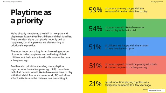
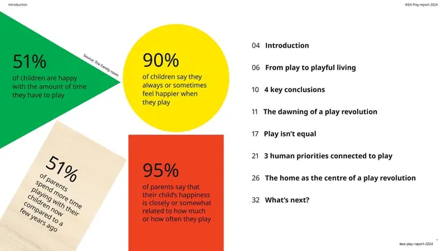
Headline and copy on the left, with five full-width color-coded bands on the right, each leading with a large percentage and a short statement.
Summary
A data slide: headline and three paragraphs on the left, with five full-height horizontal color bands stacked on the right, each opening with an oversized percentage in black and a one-line statement.
Visual description
White ground. "Playtime as a priority" headline top-left in oversized black sans-serif, with three paragraphs on parents prioritizing happiness over educational skills. The right half is filled by five stacked full-width bands in brand colors (yellow, green, blue, red, yellow again), each split into a darker and lighter tone left-to-right, with a large black percentage at the left edge and supporting text in black to its right: 59% very happy with play time, 54% want more time, 51% of children happy, 51% spend more time, 21% spend more family time. A "Source: The Family room" credit sits at the bottom.
Key takeaway
Stacking full-bleed color bands as a percentage list so the right half reads as one solid block of brand color rather than a chart with whitespace. The two-tone split on each band adds subtle texture and a sense of a filled bar without plotting an axis.
Reuse notes
A reusable layout for presenting a cluster of related survey percentages. The color-band stack is bolder than a bar chart and fills the frame, good when you want impact over precision. Keep each band to one number and one short statement.
From this deck: Playtime as a priority percentage bands
View deck

More like this






Keep what you find
A free account saves references to boards and can send you a weekly email of picks based on what you save.
To see every result, go Pro.