Preview image. Unlock full-res
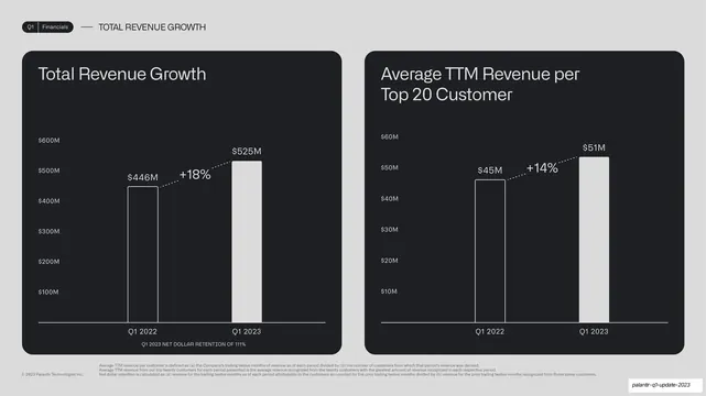
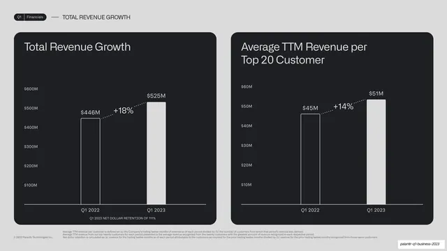
Two side-by-side dark cards, Total Revenue Growth (+18%) and Average TTM Revenue per Top 20 Customer (+14%), each a two-bar chart, with a net-dollar-retention footnote.
Summary
A two-up data slide: Total Revenue Growth (+18%, to $525M) and Average TTM Revenue per Top 20 Customer (+14%, to $51M), each a two-bar year-over-year chart in a dark card.
Visual description
Light-grey background, "Q1 | Financials" pill tab and "TOTAL REVENUE GROWTH" label up top. Two equal near-black rounded cards: the left "Total Revenue Growth" shows $446M rising to $525M with a dotted "+18%" connector and a small caps note below it ("Q1 2023 NET DOLLAR RETENTION OF 111%"); the right "Average TTM Revenue per Top 20 Customer" shows $45M rising to $51M with a "+14%" connector. Several lines of small definitional footnotes run along the bottom of the slide.
Key takeaway
The same two-up chart chassis, now carrying an extra in-card caps annotation (net dollar retention) tucked under one chart, showing how a secondary metric can ride along without a new element. The dense footnote band keeps definitions on-slide for an investor audience.
Reuse notes
Reuse for paired headline metrics where one needs a supporting stat. The small in-card caps line is a tidy way to add context without cluttering the chart. Keep the footnotes small and grouped at the bottom so they read as reference, not body copy.
From this deck: Total revenue and top-20 customer two-up
View deck










More like this



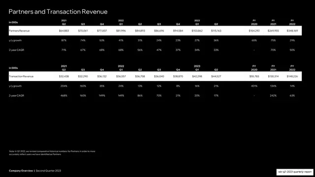


Keep what you find
A free account saves references to boards and can send you a weekly email of picks based on what you save.
To see every result, go Pro.