Preview image. Unlock full-res
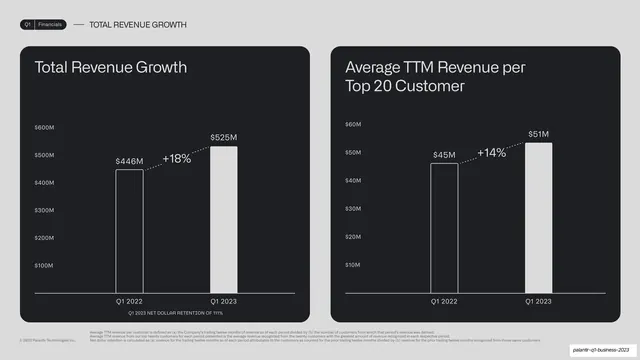
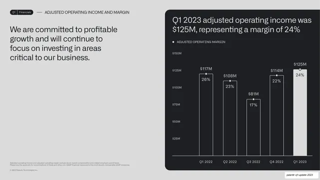
Two side-by-side dark chart cards for Total Revenue Growth and Average TTM Revenue per Top 20 Customer, each a two-bar year-over-year chart with a dotted percent callout.
Summary
A revenue scale two-up: side-by-side dark chart cards for Total Revenue Growth and Average TTM Revenue per Top 20 Customer, each a two-bar year-over-year chart with a dotted percent callout.
Visual description
A light grey slide in the established two-up layout. Running header reads "Q1 | Financials" and "TOTAL REVENUE GROWTH". Left card, "Total Revenue Growth", plots Q1 2022 ($446M, outlined) to Q1 2023 ($525M, solid) with a dotted "+18%" callout and a small monospace caption "Q1 2023 NET DOLLAR RETENTION OF 111%" beneath the bars. Right card, "Average TTM Revenue per Top 20 Customer", plots Q1 2022 ($45M) to Q1 2023 ($51M) with a dotted "+14%" callout. Small grey footnotes define the TTM and net-dollar-retention measures at the bottom.
Key takeaway
Tucking a supporting stat (net dollar retention) as a small caption inside the chart card, so one card carries a primary trend plus a secondary proof point without clutter. The two-up keeps a high-level metric beside a per-customer metric for context.
Reuse notes
Good for pairing an aggregate metric with a unit-economics metric. The in-card caption is a tidy place for a single supporting figure. Keep footnote definitions for any non-GAAP or derived measure, consistent with the rest of the deck.
From this deck: Total revenue and TTM per top-20 customer two-up
View deck





More like this





Keep what you find
A free account saves references to boards and can send you a weekly email of picks based on what you save.
To see every result, go Pro.