Preview image. Unlock full-res
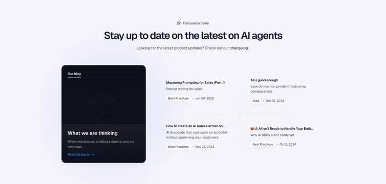
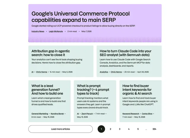
Light resources block pairing one tall dark featured blog card with a two-by-two grid of dated article links.
Summary
A light blog-resources section that gives one post a tall dark feature card on the left and lists four more as compact dated links in a two-by-two grid on the right. The defining move is the single dark card carrying the visual weight while the rest stay as quiet text rows.
Visual description
A centered "Featured articles" eyebrow with a small icon sits above an oversized dark headline and a one-line sub with an inline "changelog" link. Below left, a tall near-black card labeled "Our blog" holds a faint patterned image area, a "What we are thinking" title, a short description, and a blue "Read all posts" link. To its right, four article entries fill a two-by-two grid, each with a title, a one-line summary, a small category pill (Best Practices, Blog), and a date, divided by thin hairlines.
Key takeaway
Promoting one post into a large dark card while keeping secondary posts as lightweight dated links, so the layout has a clear focal point without five competing thumbnails. The hairline-divided two-by-two grid that lists articles cleanly without images.
Reuse notes
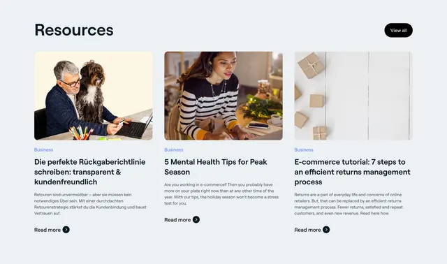
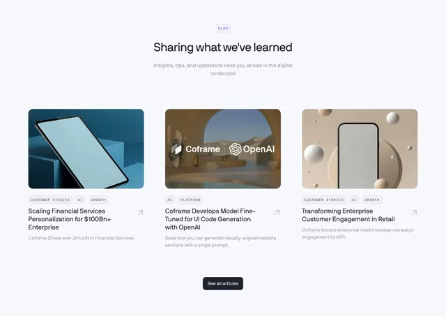
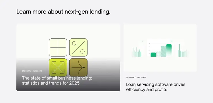
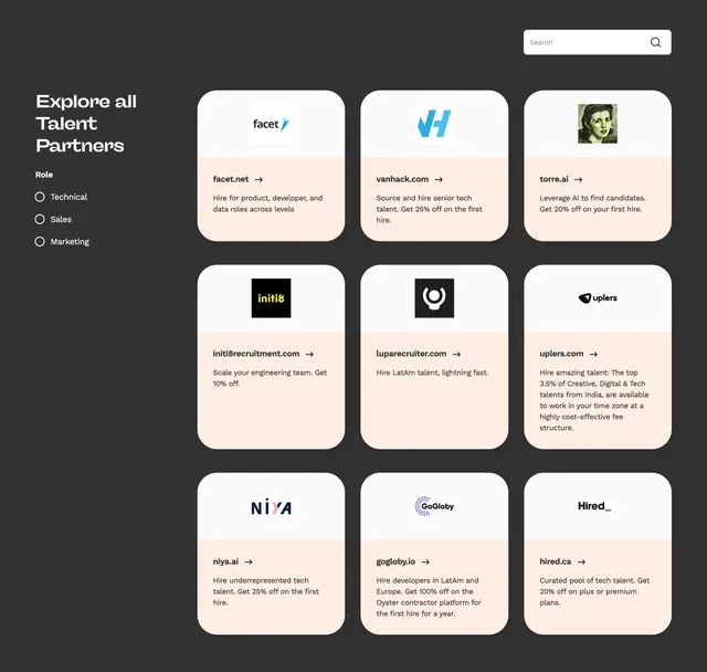
Ideal for a homepage "from the blog" or resources teaser where you want to spotlight one piece and still surface several others. Works without per-article imagery, which saves asset work. The dark feature card needs a background texture or it reads flat next to the airy link grid.
More resources sections
See all

More like this
Keep what you find
A free account saves references to boards and can send you a weekly email of picks based on what you save.
To see every result, go Pro.