Preview image. Unlock full-res
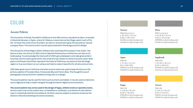
Six named accent colors, two grays and four brights, with PMS values and on-dark/on-light hex pairs, plus strict rules limiting their use.
Summary
The accent-palette page, defining a secondary set of six plant-named colors plus two neutrals, with explicit limits keeping them out of logos, headlines and color fields.
Visual description
Left column: "COLOR" caps, an "Accent Palette" Spectral subhead, and several paragraphs naming the colors after California plants and the campus's Spanish heritage, with a bolded restriction that the accent palette may not be used in logos or as background color blocks. The right two-thirds is a 3x2 grid of swatches, each with a name and PMS plus dual on-dark / on-light hex values: warm gray "Terraza" and cool gray "Plaza" on top; teal "Agave" and green "Sagebrush" in the middle; orange "Poppy" and yellow "Yarrow" at the bottom. The brights are noticeably more saturated than anything in the primary palette.
Key takeaway
Quarantining accent colors with hard rules ("charts and tables only, never logos or headlines") is what keeps the brand's blue-on-white core intact while still allowing data and wayfinding color. Providing separate on-dark and on-light hex values per accent solves contrast issues up front. The botanical naming ties the palette to place.
Reuse notes
A useful template for any brand that needs a constrained secondary palette for infographics without letting it leak into core applications. The dual light/dark hex pairs are worth copying for any color used on variable backgrounds. Pairs with the primary-palette and stats pages.
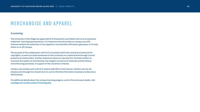
From this deck: Accent color palette
View deck


More like this






Keep what you find
A free account saves references to boards and can send you a weekly email of picks based on what you save.
To see every result, go Pro.