Preview image. Unlock full-res
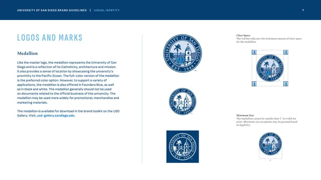
The circular illustrated medallion shown in full-color, one-color and reversed versions with clear-space and minimum-size diagrams.
Summary
The medallion page, documenting a circular illustrated emblem of the Immaculata against the Pacific Ocean, in three color versions with the usual clear-space and minimum-size diagrams.
Visual description
Left column: "LOGOS AND MARKS" caps, a "Medallion" Spectral subhead, and body copy on the medallion's meaning and its promotional, merchandise-leaning use, with a bright-blue toolkit link. The center column stacks three circular medallions, each a detailed line illustration of the church, palm trees and a shoreline ringed by "UNIVERSITY OF SAN DIEGO / EST. 1949": full-color blue at top, a smaller mid version, and a reversed white version on a Founders Blue square. The right column shows a "Clear Space" diagram boxing the medallion with corner spacing units and a "Minimum Size" version dimensioned at 1" width. Tone is blue-on-white throughout.
Key takeaway
Treating a more decorative, scene-based emblem as a distinct mark with its own rules, clearly scoped to promotional and merchandise use, keeps it from competing with the formal seal and master logo. Repeating the same clear-space and minimum-size diagram language across every mark builds a predictable rulebook.
Reuse notes
Reach for this when a brand maintains an illustrative or commemorative badge alongside its primary logo. The page is a clean model for documenting a circular emblem. Pairs with the seal and monogram pages as part of a layered marks family.
From this deck: The medallion mark, clear space and minimum size
View deck






More like this








Keep what you find
A free account saves references to boards and can send you a weekly email of picks based on what you save.
To see every result, go Pro.