Preview image. Unlock full-res
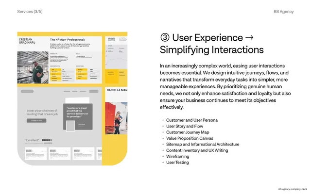
Split service slide pairing a left collage of UX persona and journey artifacts with a right column of numbered heading, paragraph, and a UX deliverables list.
Summary
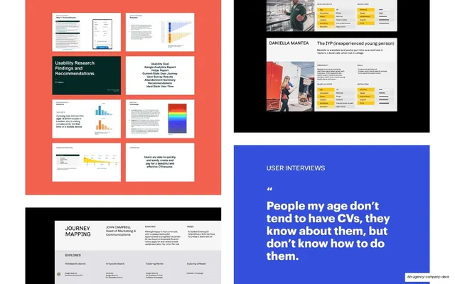
The third of five service slides: a left-side collage of UX persona sheets, a journey map, and product screenshots over a yellow ground, paired with a right column whose numbered "③ User Experience" heading and bullet list lay out the UX offering.
Visual description
White slide, 16:9, with a thin running header ("Services (3/5)" left, "BB Agency" right). The left half holds a rounded-corner collage on a saturated yellow background: a warehouse-worker persona card ("Cristian Gradinaru"), a faint line-chart journey map, a grey landing-page mockup with a testimonial pull-quote, and a second persona panel. The right half leads with the oversized heading "③ User Experience → Simplifying Interactions", a multi-line grey paragraph, and a bulleted deliverables list (Customer and User Persona, User Story and Flow, Customer Journey Map, Value Proposition Canvas, Sitemap and Informational Architecture, Content Inventory and UX Writing, Wireframing, User Testing). Type is a clean sans; color comes only from the yellow collage.
Key takeaway
The same circled-number-plus-arrow heading carried across the set, swapping only the accent color per service (here yellow) so the slides feel related but distinct. Showing real UX artifacts (personas, journey maps, wireframes) as proof rather than describing the process abstractly.
Reuse notes
Drop-in member of a numbered services sequence; works when you can show genuine deliverables in the collage. The single bold accent color per slide is the cheapest way to differentiate otherwise identical layouts. Pairs directly with the other Services slides in this deck.
From this deck: User experience service, simplifying interactions
View deck
















More like this






Keep what you find
A free account saves references to boards and can send you a weekly email of picks based on what you save.
To see every result, go Pro.