Preview image. Unlock full-res
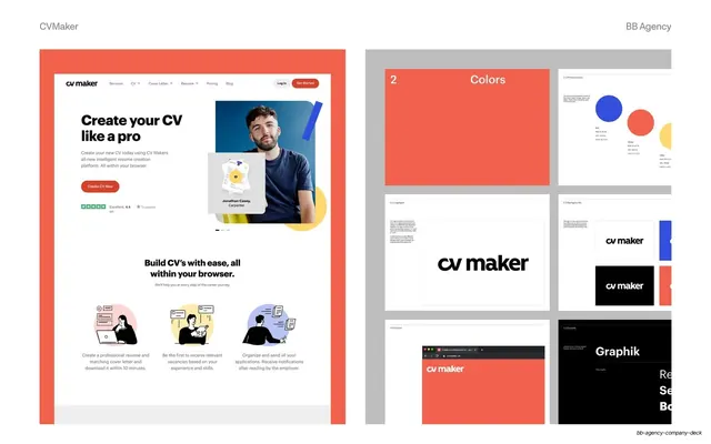
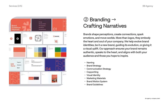
Two-panel CVMaker showcase pairing the coral homepage mockup with a grey grid of brand-guideline thumbnails for colors, logotype and type.
Summary
A side-by-side CVMaker slide: the coral-framed marketing homepage on the left next to a grey panel holding a grid of brand-guideline page thumbnails on the right.
Visual description
White slide, "CVMaker" and "BB Agency" grey labels. Left panel sits in a solid coral-orange frame and shows the CVMaker homepage: a "cv maker" nav, a "Create your CV like a pro" hero with a portrait and a coral "Create CV Now" button, a Trustpilot rating, then a "Build CV's with ease" section with three black-line illustrations on pastel circles. Right panel is a grey artboard with a grid of brand-guideline thumbnails: a coral "2 Colors" divider, primary-colors swatches (blue, coral, yellow circles), the "cv maker" logotype, backgrounds, a favicon screen, and a "Graphik" type-specimen. Coral and the lowercase "cv maker" wordmark unify both halves.
Key takeaway
The recurring left-homepage / right-system grid that lets each case study show the live product and the underlying brand kit in one frame. Wrapping the homepage in the brand's accent color (coral here) frames the screen and reinforces the palette at the same time.
Reuse notes
A reusable two-up for identity-plus-web projects. Swap the accent frame per client to color-code each case. Needs a real guideline set to fill the right grid; works best when the homepage already uses the same accent so the panels feel of a piece.
From this deck: CVMaker homepage and brand-system two-up
View deck


More like this




Keep what you find
A free account saves references to boards and can send you a weekly email of picks based on what you save.
To see every result, go Pro.