Preview image. Unlock full-res
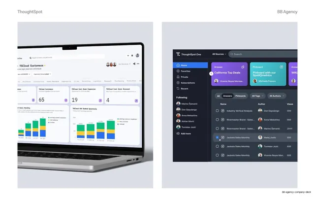
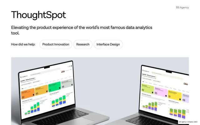
Two-up product mockup pairing an angled laptop dashboard with a dark-themed content library list view on a lavender field.
Summary
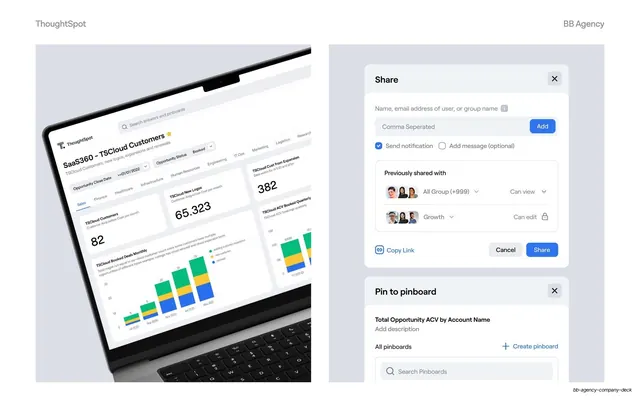
A second ThoughtSpot detail slide: an angled laptop dashboard on the left and a dark content-library list view, with sidebar and data table, on the right.
Visual description
Two soft lavender-grey panels split the slide. The left panel shows an angled MacBook mockup, its screen filled with a light "TSCloud Customers" dashboard of stat cards (65, 19, 4) and two stacked bar charts (TSCloud Booked Deals Monthly, ACV Booked Quarterly). The right panel holds a larger, mostly dark-themed "ThoughtSpot One" UI: a left sidebar (Home, Favorites, Private, Subscriptions, Recent, plus a Following list of avatars), three gradient content cards across the top (Answer, Pinboard), and a tabbed table of items (Answers / Pinboards) listing names, authors and view counts. Headers read "ThoughtSpot" left and "BB Agency" right.
Key takeaway
Showing the breadth of an app by contrasting two surfaces: a light data dashboard and a dark navigation/library view, side by side on one ground. It communicates "this is a full system" more than a single screen could.
Reuse notes
Use when a case study needs to convey scope across multiple app areas. The consistent lavender ground and angled-device convention link it to the other ThoughtSpot slides. Keep mockups large enough that the UI stays legible; here the right view is shown near full size to make the list readable.
From this deck: ThoughtSpot dashboard and library mockups
View deck
More like this
Keep what you find
A free account saves references to boards and can send you a weekly email of picks based on what you save.
To see every result, go Pro.