Preview image. Unlock full-res
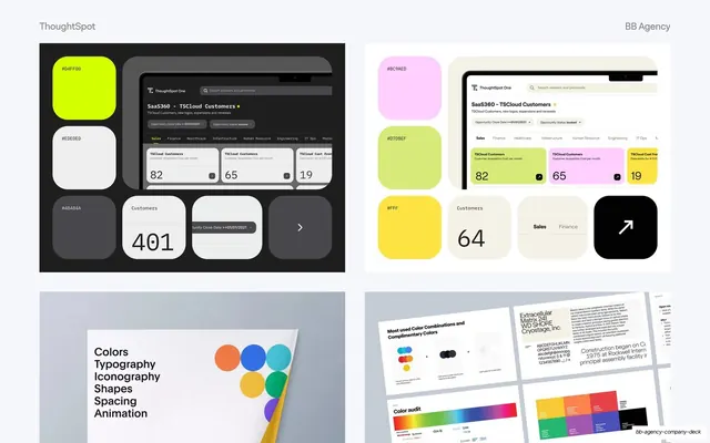
Four-panel brand-system grid showing color swatches with hex codes on dark and light UI tiles, a foundations list, and brand spreads.
Summary
A behind-the-scenes design-system slide: four panels of color swatches with hex codes laid over product UI tiles, plus a foundations list and brand-spec spreads.
Visual description
A 2-by-2 grid of explorations on a pale background. Top-left is a dark panel with rounded color tiles (#D4FF00 lime, #EDEDED, #4B484A) interleaved with dark UI component tiles (a ThoughtSpot dashboard, stat cards "82 65 19", a "401" customers card, a chevron tile). Top-right repeats the idea on a light panel with pastel swatches (#BC9AED, #D7DBEF, #FFF, yellow) and light UI tiles ("64" card, Sales/Finance tabs, a black arrow tile). Bottom-left is a printed sheet listing the foundations "Colors / Typography / Iconography / Shapes / Spacing / Animation" beside a cluster of colored dots and a folded yellow corner. Bottom-right shows brand-spec spreads: a type specimen, "Most used Color Combinations", a rainbow color audit, and a competitor logo grid. Headers read "ThoughtSpot" left and "BB Agency" right.
Key takeaway
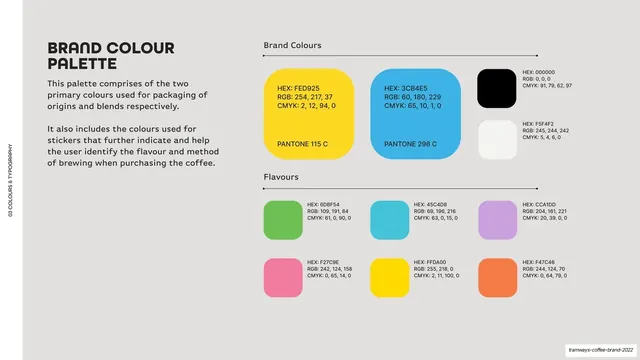
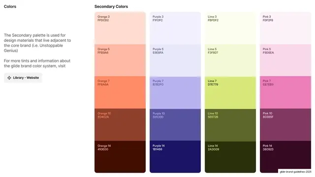
Presenting a design system as a curated bento of artifacts: color chips annotated with their exact hex values sitting right next to the real UI tiles they produce. Showing swatch and application together proves the system is built, not just decorated.
Reuse notes
A great "process" or "design system" slide for the back half of a case study, where you show craft after showing outcomes. The dark-panel / light-panel pairing demonstrates the palette in both modes. Keep hex labels legible; this slide rewards a viewer who leans in, so do not shrink the tiles too far.
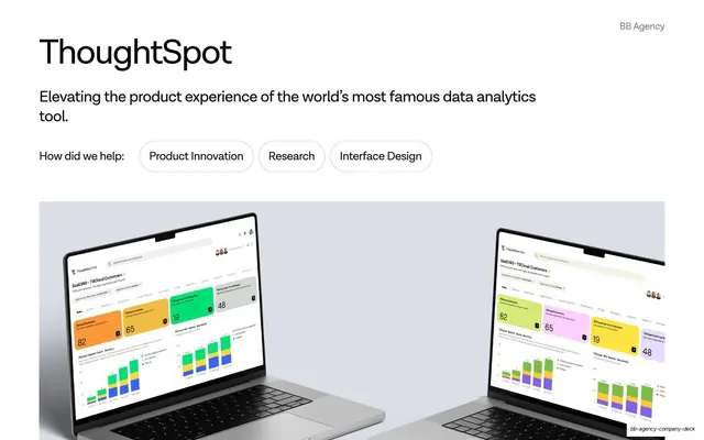
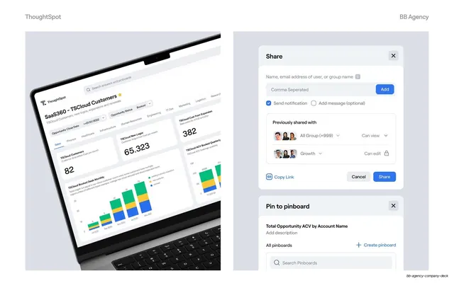
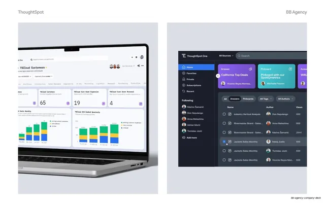
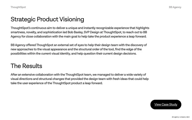
From this deck: ThoughtSpot color and component explorations
View deck

More like this
Keep what you find
A free account saves references to boards and can send you a weekly email of picks based on what you save.
To see every result, go Pro.