Preview image. Unlock full-res
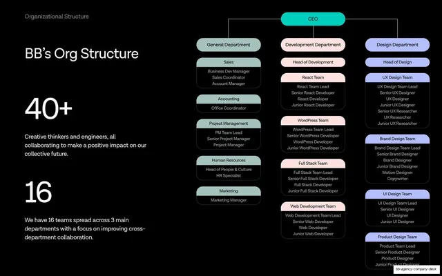
Dark org-chart slide pairing oversized 40+ and 16 stats on the left with a colour-coded three-department hierarchy tree on the right.
Summary
A dark organizational-structure slide: oversized "40+" and "16" headline stats with supporting copy on the left, and a colour-coded org-chart tree of three departments branching from the CEO on the right.
Visual description
Near-black slide, "Organizational Structure" grey label top-left and "BB's Org Structure" as a white headline beneath it. The left column carries two oversized white numerals, "40+" ("Creative thinkers and engineers...") and "16" ("We have 16 teams spread across 3 main departments..."). The right two-thirds is a tidy org chart: a teal "CEO" node at top branches into three pastel-tinted columns, "General Department" (mint), "Development Department" (pink), and "Design Department" (lavender), each stacked with rounded team cards (Sales, Accounting, PM, HR, Marketing; React, WordPress, Full Stack, Web Dev; UX, Brand, UI, Product) listing roles in small white text. Thin connector lines link the nodes.
Key takeaway
Pairing the human-scale headline stats ("40+", "16") with a full color-coded hierarchy on the same slide, so the audience gets both the soundbite and the proof of structure at once. Tinting each department column a different pastel makes a dense tree instantly scannable on a dark ground.
Reuse notes
A reusable team-structure or org-chart slide for company and capabilities decks. The oversized-stat-plus-diagram split is a strong way to make an org chart feel like a flex rather than an HR document. Best when the tree is genuinely tidy; an overloaded chart would fight the clean stat column.
From this deck: BB's Org Structure chart with headline stats
View deck