Preview image. Unlock full-res
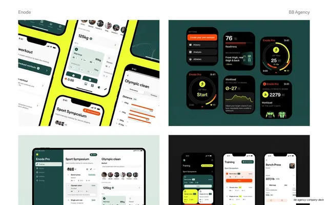
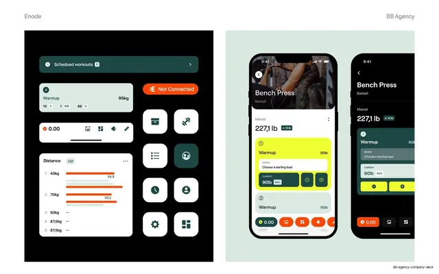
Four-quadrant grid of Enode product mockups across angled phones, smartwatch tiles, an iPad, and a phone trio on alternating colored backgrounds.
Summary
A four-panel grid showing the Enode app across device types: angled phone mockups, smartwatch interface tiles, an iPad, and a trio of phones, each quadrant on its own colored background.
Visual description
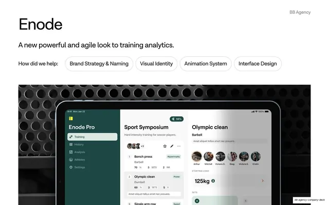
White slide with a thin grey running header ("Enode" left, "BB Agency" right). The body is a 2x2 grid of image panels. Top-left: several phones lying at an angle on a bright lime-yellow surface showing workout and Olympic-clean screens. Top-right: a deep-teal panel with a bento layout of smartwatch and dark app cards, displaying readiness scores (76), workload metrics, line charts, and circular "Start" timers in lime and orange. Bottom-left: a pale sage panel with an iPad showing the Enode Pro dashboard (left nav, Sport Symposium list, Olympic clean detail). Bottom-right: a near-black panel with three phones showing the training and bench-press flows. The accent colors (lime, orange, teal) repeat across all four quadrants.
Key takeaway
The 2x2 device grid as a single "everywhere" slide: phone, watch, and tablet shown together to prove the design scales across the whole product surface. Giving each quadrant a different brand-colored backdrop keeps the grid lively while the repeated accent palette holds it together.
Reuse notes
A compact way to summarize a multi-platform product or responsive design system on one slide, ideal late in a case study as a capability flex. Works for any app spanning phone, tablet, and wearable. Requires a full set of polished mockups; thin or placeholder screens would undercut the "complete system" message.
From this deck: Enode phone, tablet, and wearable interfaces
View deck



More like this
Keep what you find
A free account saves references to boards and can send you a weekly email of picks based on what you save.
To see every result, go Pro.