Preview image. Unlock full-res
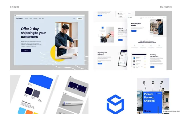
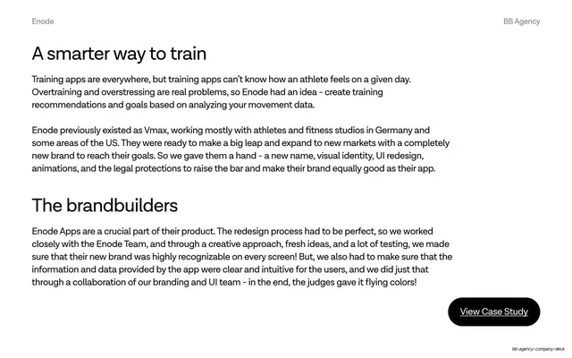
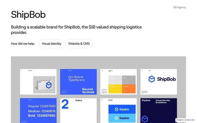
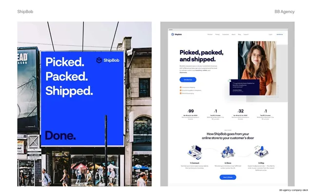
Four-quadrant ShipBob montage of website mockups, a colour and stationery board, the cube logo, and the billboard, all on grey artboards.
Summary
A four-up ShipBob asset board showing, clockwise, a "2-day shipping" homepage hero, a grid of product and reporting screens, the billboard crop, the blue cube logo, and a colour-and-stationery board.
Visual description
White slide with "ShipBob" and "BB Agency" grey labels. The slide is split into four quadrants on grey artboards. Top-left: a marketing hero, "Offer 2-day shipping to your customers," with a packing photo and a yellow sun motif. Top-right: a loose collage of product UI screens, returns management, reporting and analytics with a phone mockup, inventory management. Bottom-left: a secondary-colors and business-card board with cobalt, navy and grey swatches plus a rolled poster mockup. Bottom-center: the large blue ShipBob cube logo on white. Bottom-right: a crop of the blue "Picked. Packed. Shipped. Done." billboard. Cobalt blue and the cube mark tie the quadrants together.
Key takeaway
The quadrant contact-sheet that surveys an entire identity, web, print, logo, and out-of-home, in a single glance, with grey artboards normalising wildly different asset shapes into one rhythm. It signals depth of deliverables without a wall of text.
Reuse notes
Good as a mid-case-study "the work" overview before the results slide. The grey-artboard grid is reusable for any project with many heterogeneous assets. Best when each quadrant is visually distinct so the grid reads as breadth, not repetition.
From this deck: ShipBob assets and UI patterns four-up grid
View deck


More like this



Keep what you find
A free account saves references to boards and can send you a weekly email of picks based on what you save.
To see every result, go Pro.