Preview image. Unlock full-res
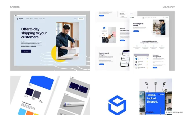
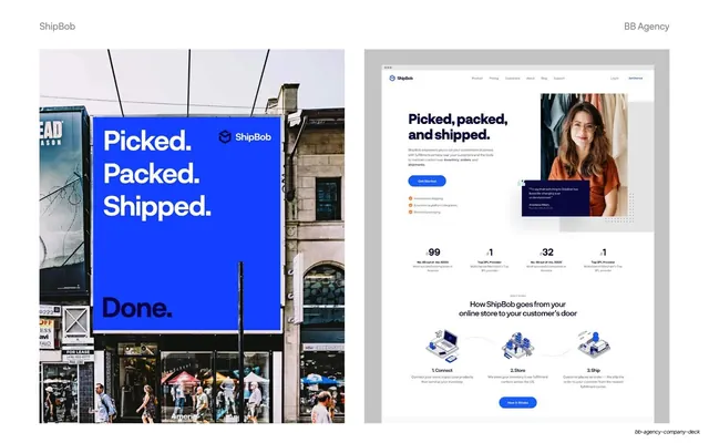
Two-panel ShipBob showcase pairing a blue out-of-home billboard photo with a full homepage mockup on a grey artboard.
Summary
A side-by-side ShipBob execution slide: a real-world blue billboard reading "Picked. Packed. Shipped. Done." next to a full marketing homepage rendered on a grey artboard.
Visual description
White slide, "ShipBob" top-left and "BB Agency" top-right as grey labels. Left panel is a street photograph of a large cobalt-blue billboard mounted on a city facade; bold white type stacks "Picked. / Packed. / Shipped." with the ShipBob cube logo, then "Done." in black, pedestrians passing below. Right panel sits on a flat grey background and shows the ShipBob homepage mockup: nav bar, a "Picked, packed, and shipped." hero with a smiling portrait, a blue "Get Started" button, a testimonial card, a four-up stat row, and a "How ShipBob goes from your online store to your customer's door" three-step isometric illustration.
Key takeaway
Pairing one bold out-of-home photo with one polished screen so a single slide proves the identity works at billboard scale and on the web. Floating the website on a neutral grey artboard keeps the focus on the design, not a browser chrome.
Reuse notes
Ideal for a brand-plus-web case study where you want to show range in one frame. The left-photo / right-mockup split is reusable for any project that lives both in physical space and on screen. Depends on a genuinely strong photograph; a flat logo lockup would not carry the left half.
From this deck: ShipBob billboard and homepage two-up
View deck