Preview image. Unlock full-res
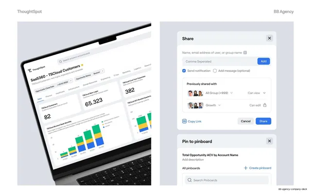
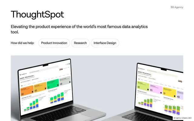
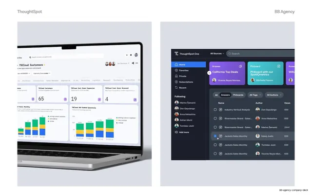
Two-up product mockup pairing an angled laptop dashboard with floating share and pin-to-pinboard modal UI on a lavender field.
Summary
A case-study detail slide showing the ThoughtSpot product up close: a laptop dashboard on the left and two floating UI modals (Share, Pin to pinboard) isolated on the right.
Visual description
Two soft lavender-grey panels split the slide. The left panel holds an angled MacBook mockup tilted toward the viewer, screen filled with a ThoughtSpot "TSCloud Customers" dashboard of stat cards (82, 65.323, 382) and a stacked bar chart. The right panel floats two clipped UI components against the same tint: a "Share" modal with an email input, an "Add" button, send-notification toggle, a "Previously shared with" list of avatar groups (All Group, Growth) with permission dropdowns, and Cancel / Share buttons; below it, the top of a "Pin to pinboard" modal with a search field. Headers read "ThoughtSpot" left and "BB Agency" right.
Key takeaway
Pairing a full in-context device shot with isolated, enlarged UI components on a matching tinted ground. The laptop sets the scene, the floating modals let you show the actual interaction detail at readable size without a second screenshot.
Reuse notes
Strong pattern for a product or UX case study where you want to show both the whole app and a specific flow. The shared background tint ties the two halves together; keep it consistent across the case-study slides. Works best when the isolated UI is genuinely well-designed and worth zooming into.
From this deck: ThoughtSpot sharing and pinboard mockups
View deck


More like this





Keep what you find
A free account saves references to boards and can send you a weekly email of picks based on what you save.
To see every result, go Pro.