Preview image. Unlock full-res
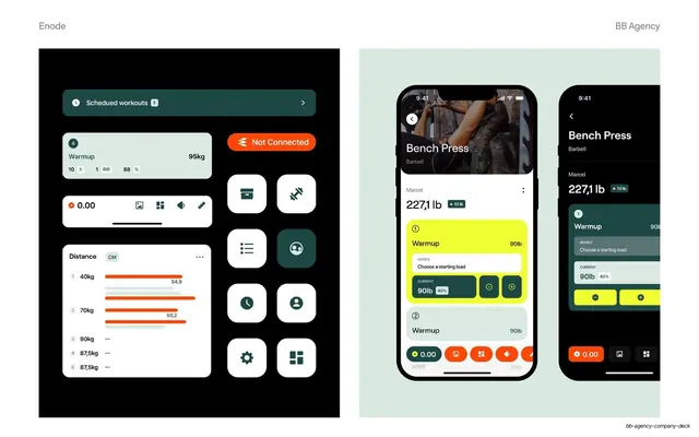
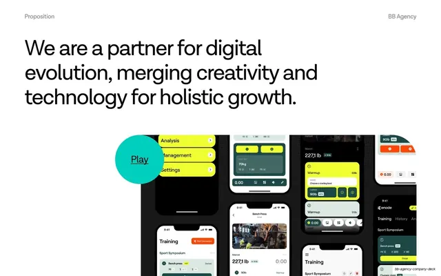
Two-panel UI showcase pairing isolated dark-mode component cards and an icon grid with two light-background phone mockups of the Bench Press screen.
Summary
A UI system slide split into two panels: loose dark-mode component cards plus a white-icon grid on the left, and two phone mockups of the Bench Press flow on the right.
Visual description
White slide with a thin grey running header ("Enode" left, "BB Agency" right). The left half is a black panel holding floating light cards (a "Scheduled workouts" pill, a warmup set card, a play/scrubber bar, a "Distance" bar-chart card with orange bars) alongside a grid of rounded white icon buttons with dark glyphs and one filled teal tile. The right half sits on a pale sage background and shows two iPhone mockups of the Bench Press exercise screen: a hero photo header, a "227,1 lb" load readout, and stacked warmup cards, one highlighted in bright lime yellow with current-load steppers, plus an orange bottom toolbar. The phones overlap and bleed off the right edge.
Key takeaway
Showing the design system both ways on one slide: deconstructed components and icon set on a dark field, then the same parts assembled into real screens. The recurring lime-yellow and orange accents tie the loose pieces to the finished UI so the system reads as one language.
Reuse notes
A useful template for presenting a component library or design system inside a case study: atoms on one side, assembled screens on the other. Works for app UI, dashboard, or design-token showcases. Needs real, on-brand components and screens; the contrast between the dark component panel and light screen panel does the visual separation.
From this deck: Enode mobile UI components and patterns
View deck





More like this

Keep what you find
A free account saves references to boards and can send you a weekly email of picks based on what you save.
To see every result, go Pro.