Preview image. Unlock full-res
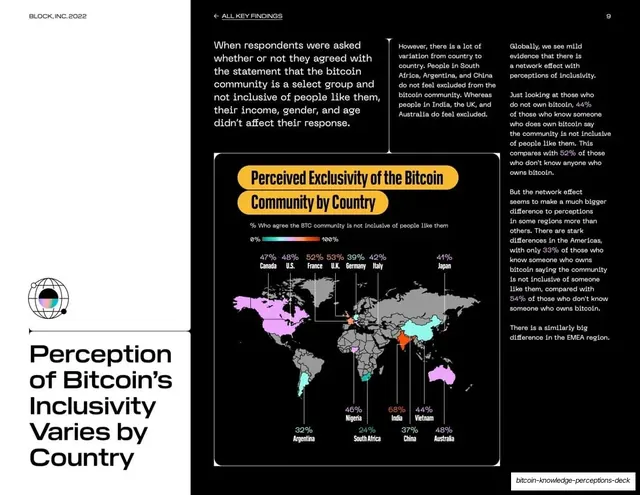
White data slide with a left-rail headline and a dark panel holding a world map shaded by perceived exclusivity of the bitcoin community, with per-country percentages.
Summary
A data slide built on a world map shaded by how exclusive each country finds the bitcoin community, with percentage callouts on each surveyed nation.
Visual description
White background with a wide black panel right. The bottom-left rail holds the headline "Perception of Bitcoin's Inclusivity Varies by Country" in large black grotesque above a small globe-style holographic icon. Three columns of body copy run along the top. The lower-right dark panel, titled in a yellow pill "Perceived Exclusivity of the Bitcoin Community by Country", shows a gray world map with surveyed countries tinted along a teal-to-pink-to-violet gradient legend (0% to 100%). Percentage labels with country names sit above and below the map (Canada 47%, U.S. 48%, France 52%, U.K. 53%, India 68%, Argentina 32%, and others), each tied to its country with a thin leader line.
Key takeaway
A choropleth world map with a gradient legend keyed to the brand colors, annotated with leader-lined percentage callouts so exact values stay visible on top of the geographic pattern. It carries a global finding in one image.
Reuse notes
Ideal when geography is the story and you have a value per country. Leader-lined labels keep precision that a pure choropleth loses. The gradient scale reuses the deck palette; keep the surveyed set small enough that callouts do not collide.
From this deck: Perceived inclusivity by country, world map
View deck

More like this









Keep what you find
A free account saves references to boards and can send you a weekly email of picks based on what you save.
To see every result, go Pro.