Preview image. Unlock full-res
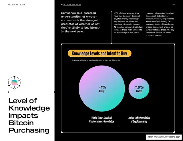
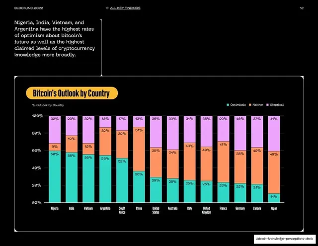
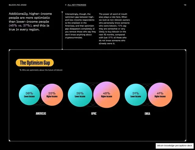
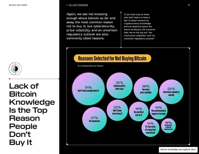
White data slide with a left-rail headline and a dark panel contrasting two gradient bubbles, a large 41% and a small 7.9%, for purchase intent by knowledge level.
Summary
A data slide whose dark panel contrasts two proportional gradient bubbles, one large and one small, to dramatize how purchase intent jumps with knowledge.
Visual description
White background with a wide black panel right. The bottom-left rail holds the headline "Level of Knowledge Impacts Bitcoin Purchasing" in large black grotesque above a small holographic icon. Three columns of body copy run across the top. The lower-right dark panel, titled in a yellow pill "Knowledge Levels and Intent to Buy", shows just two teal-to-violet gradient circles: a large one labeled "41% Likely / Fair to Expert Levels of Cryptocurrency Knowledge" and a much smaller one labeled "7.9% Likely / Limited to No Knowledge of Cryptocurrency".
Key takeaway
Reducing a chart to two proportional bubbles when the entire point is a single dramatic ratio; the size difference does the persuading before the reader parses the numbers. Maximum signal, minimum chart furniture.
Reuse notes
Use the two-bubble contrast for a punchy single comparison, especially a "5x difference" style stat. Print both percentages since area is read approximately. A strong, slide-filling way to land one headline number against its baseline.
From this deck: Knowledge levels and intent to buy, two bubbles
View deck

More like this








Keep what you find
A free account saves references to boards and can send you a weekly email of picks based on what you save.
To see every result, go Pro.