Preview image. Unlock full-res
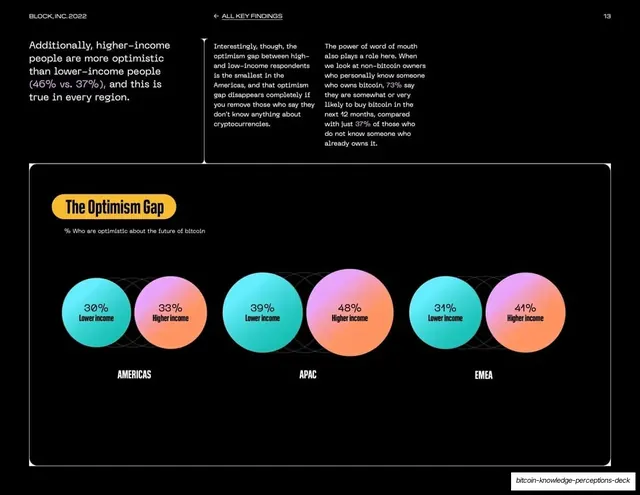
White data slide with intro copy over a wide dark panel holding three pairs of teal and pink gradient circles comparing lower- and higher-income optimism by region.
Summary
A data slide that visualizes the income optimism gap as three pairs of overlapping gradient circles, one pair per region, each labeled with a percentage.
Visual description
White background. A short headline at top left, "Additionally, higher-income people are more optimistic than lower-income people (46% vs. 37%), and this is true in every region", with colored percentage figures, sits beside two columns of supporting copy. The lower two-thirds is a single wide dark rounded panel titled in a yellow pill "The Optimism Gap". Inside, three labeled groups (Americas, APAC, EMEA) each show two overlapping circles, a teal-gradient "Lower income" and a pink-to-orange "Higher income", with the percentage centered in each (Americas 30%/33%, APAC 39%/48%, EMEA 31%/41%), set over faint dashed guide patterns.
Key takeaway
Proportional gradient circles as a softer, more designed alternative to bars for simple paired comparisons, with the value typeset inside each circle. The slight overlap of each pair reads as direct comparison. The gradients carry the brand without a chart frame.
Reuse notes
Best for a small number of two-value comparisons where you want a more visual, less clinical feel than a bar chart. Keep figures inside the circles so the comparison is legible. Circle area is hard to judge precisely, so always print the numbers as done here.
From this deck: The optimism gap, paired gradient circles
View deck


More like this








Keep what you find
A free account saves references to boards and can send you a weekly email of picks based on what you save.
To see every result, go Pro.