Preview image. Unlock full-res
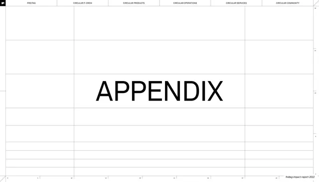
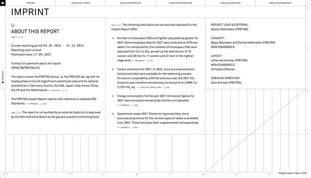
Near-empty section divider with a single centered "APPENDIX" headline over the report's faint construction grid.
Summary
A palate-cleansing section divider: almost the whole page is white, with a single large centered "APPENDIX" word and the report's faint grid the only other marks.
Visual description
White page under the same six-chapter top nav, here drawn as thin outlined tabs with none filled solid, signaling a between-chapters break. A faint horizontal-and-vertical construction grid with small ruler ticks runs across the whole field. Centered on it is one large word, "APPENDIX", in a clean mixed-case sans, with no other copy. A small FREITAG flag mark sits top left and the running footer sits bottom right. The deliberate emptiness contrasts sharply with the dense pages around it.
Key takeaway
Using a near-blank page with one centered word to mark a major section break, giving a long document breathing room. Leaving the underlying construction grid faintly visible ties the divider to the rest of the system rather than floating the word in a void.
Reuse notes
A clean section-divider pattern for any long report or deck that needs clear chapter breaks. Reuse the single-word-on-grid treatment for every section opener so the dividers form a consistent set. The empty space only works if the surrounding pages are dense enough to make the pause feel earned.
From this deck: Appendix section divider
View deck


















More like this






Keep what you find
A free account saves references to boards and can send you a weekly email of picks based on what you save.
To see every result, go Pro.