Preview image. Unlock full-res
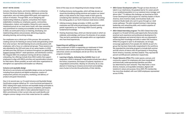
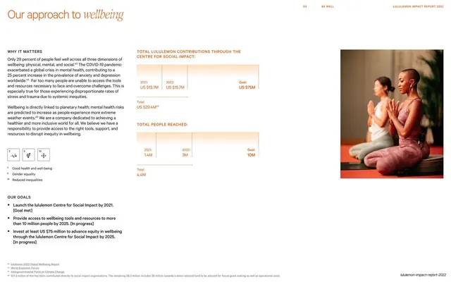
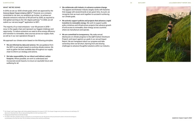
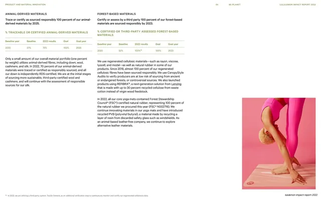
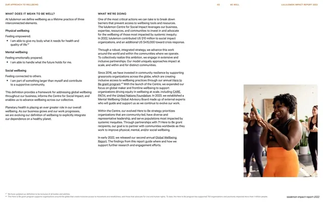
A dense two-column "what we're doing" text spread paired with a cropped photo of a person in orange lululemon activewear at right.
Summary
A report-style body spread: a running header, a left "What we're doing" narrative built from labeled sub-sections, and a cropped image of a model in orange activewear filling the lower right.
Visual description
Off-white background. A thin running header reads section number and labels left ("Our approach to wellbeing"), "03 / BE WELL" center, "LULULEMON IMPACT REPORT 2022" right, over a hairline rule. The left two-thirds is set in two narrow columns of small sans-serif body copy, organized under small all-caps headings ("What does it mean to be well?", "Physical wellbeing", "Mental wellbeing", "Social wellbeing") each followed by a one-line bold lead and footnote markers. The lower-right quadrant holds a tightly cropped color photograph of a person in bright orange lululemon leggings against a dark ground, bleeding to the slide edges. A footnote line runs along the bottom; the report wordmark sits bottom-right.
Key takeaway
The report grammar: tiny all-caps sub-section labels threading a long argument into scannable units, with a single warm product photo anchoring one corner to keep an otherwise text-heavy page human. The fixed running header gives a 90-plus-page document continuity.
Reuse notes
Ideal for content-dense report or whitepaper interiors that still need to feel designed. Reserve the photo for a corner so it punctuates rather than competes with the text. The multi-column small body works in print or PDF but is tight for on-screen presentation; size up for projection.
From this deck: What wellbeing means, two-column text over athletic photo
View deck