Preview image. Unlock full-res
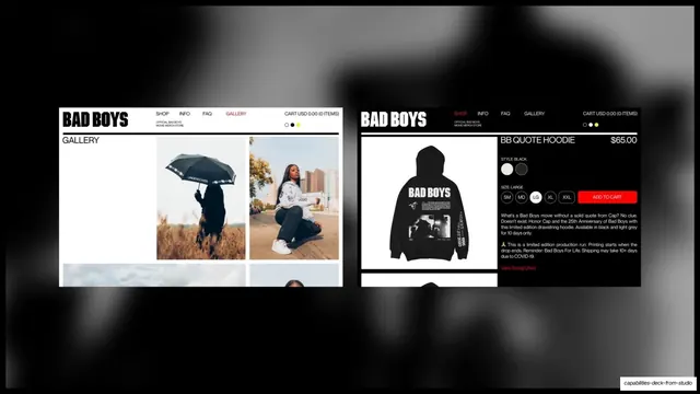
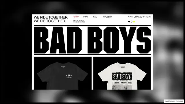
Two Bad Boys store screens floating on a blurred dark backdrop, a light Gallery grid and a dark product page for the BB Quote Hoodie.
Summary
Two Bad Boys store pages float on a blurred dark backdrop: a light Gallery grid on the left and a dark product page for the "BB Quote Hoodie" on the right.
Visual description
A blurred dark photographic background with two browser windows floating over it. The left window is a light "GALLERY" page with the "BAD BOYS" logo nav, carousel dots, and a grid of lifestyle photos (a model with the printed umbrella, a kneeling model, sky, more). The right window is a dark product page: "BB QUOTE HOODIE" at "$65.00", a black hoodie shot, black/grey style swatches, a SM/MD/LG/XL/XXL size selector with LG active, a red "ADD TO CART" button, and product copy. Red appears only on the active nav link and the cart button, against an otherwise black-and-white commerce UI.
Key takeaway
Pairing a content-led gallery page with a functional product page on one slide shows the store works both as a lookbook and as real commerce. The single red call-to-action against strict black and white keeps a busy product page calm and focused.
Reuse notes
A clean way to present two distinct page types from one e-commerce build. Floating both over a blurred background keeps the focus on the UI rather than chrome. Use a single accent color for actions so the commerce moments pop without breaking the palette.
From this deck: Bad Boys e-commerce gallery and product page
View deck

More like this


Keep what you find
A free account saves references to boards and can send you a weekly email of picks based on what you save.
To see every result, go Pro.