Preview image. Unlock full-res
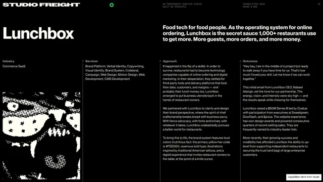
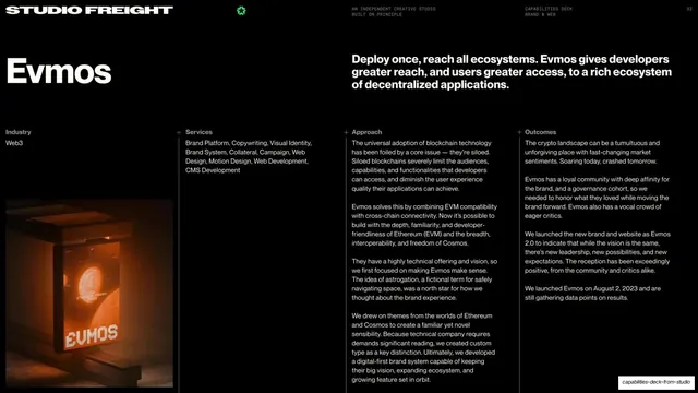
Dark Lunchbox case-study opener with an oversized brand name left and four columns of Industry, Services, Approach, and Outcomes copy over a halftone image.
Summary
The Lunchbox case-study opener: a near-black slide with the oversized "Lunchbox" name top-left, a bold summary line up top, and four labeled body columns (Industry, Services, Approach, Outcomes) above a high-contrast halftone image.
Visual description
Solid near-black background with the deck's tiny white all-caps running header (STUDIO FREIGHT, green mark, "AN INDEPENDENT CREATIVE STUDIO / BUILT ON PRINCIPLE", "CAPABILITIES DECK / BRAND & WEB", page "24"). An oversized white "Lunchbox" headline sits at upper-left; to its right a bold white intro line reads "Food tech for food people..." A four-column text grid runs beneath, each column led by a small plus mark and a label (Industry / Services / Approach / Outcomes) over justified grey body copy that mentions the brand's primary yellow hex (#FEED01). The lower-left corner holds a gritty black-and-white halftone photograph, partly cropped off the edge. Thin column rules separate the text blocks.
Key takeaway
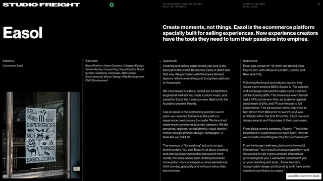
A single dense reference slide that frames an entire case with the same four headings every time (Industry, Services, Approach, Outcomes), letting a reader scan the whole engagement at once. The oversized brand name plus tiny utility labels keeps it editorial despite the data density.
Reuse notes
A strong template for the first slide of any portfolio case study where you want context before the visuals. Reusable verbatim across cases by swapping the name, intro line, and four columns. Best on dark with one halftone image to add texture without color.
From this deck: Lunchbox case study intro and overview
View deck






More like this





Keep what you find
A free account saves references to boards and can send you a weekly email of picks based on what you save.
To see every result, go Pro.