Preview image. Unlock full-res
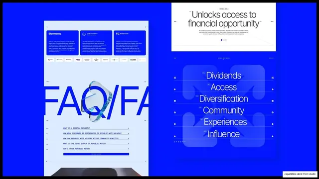
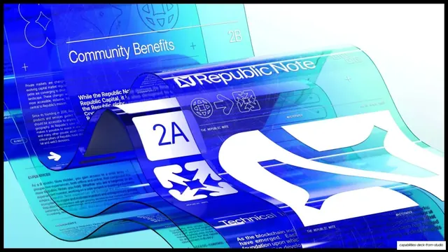
Electric-blue case-study slide showing two Republic Note web screens, an FAQ page with oversized FAQ type and a stacked benefits list.
Summary
A saturated-blue case-study slide presenting two Republic Note site screens side by side: a press-quote and FAQ page on the left, and a stacked single-word benefits hierarchy on the right.
Visual description
Full electric-blue (#1A1AFF) background. The left screen is a tall pale-blue web page: a three-card press-quote row (Bloomberg, Cointelegraph, TechCrunch) over a strip of media logos, then a giant blue "FAQ/FA" headline bleeding behind a small 3D glass coin, then an all-caps FAQ accordion list with plus toggles and a filled "Find More Answers" button. The right side stacks two darker-blue panels: a top "Unlocks access to financial opportunity" serif-ish headline screen with utility nav, and below it a benefits list, six centered words (Dividends, Access, Diversification, Community, Experiences, Influence) on hairline-separated rows with tiny index labels and a faint oversized X watermark. Thin lines and small icons frame each row.
Key takeaway
Using a single brand color edge-to-edge as the slide canvas so embedded UI screens read as a unified system. The oversized cut-off "FAQ" word behind a small product object is a strong way to label a section without a separate header. The one-word-per-row benefits ladder turns a feature list into a confident hierarchy.
Reuse notes
Works for showcasing multiple screens of one product in a single brand color. Needs a bold brand hue and clean UI mockups to hold up. The all-caps monospace utility labels reinforce a technical, Web3 feel; soften them for a consumer brand.
From this deck: Republic Note FAQ and benefits hierarchy
View deck






More like this






Keep what you find
A free account saves references to boards and can send you a weekly email of picks based on what you save.
To see every result, go Pro.