Preview image. Unlock full-res
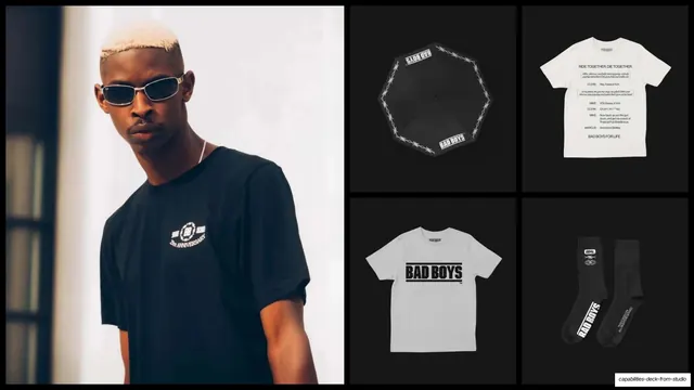
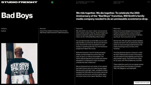
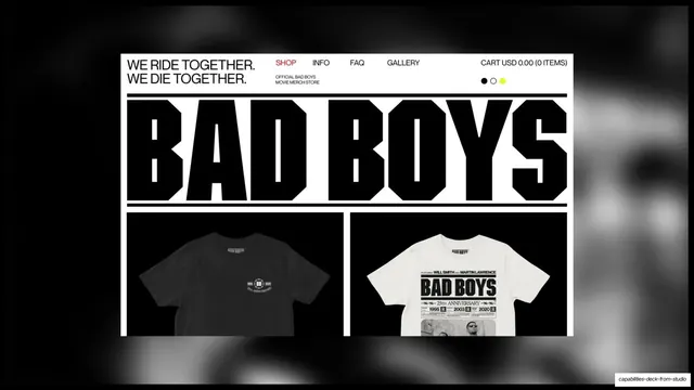
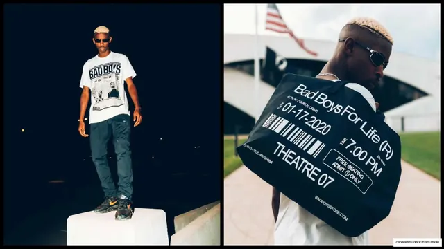
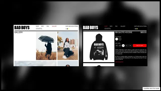
Bad Boys merch shown as a model portrait beside a 2x2 product grid of umbrella, quote tee, logo tee, and branded socks on black.
Summary
Bad Boys merch presented as a tall lifestyle portrait on the left and a four-up product grid of accessories and apparel on the right.
Visual description
Black slide split left/right. The left half is a portrait of a model in sunglasses wearing a black "Bad Boys 25th Anniversary" tee against a bright window. The right half is a 2x2 grid on dark grey: a black umbrella with a barbed-wire-and-logo print, a white tee printed with movie dialogue ("RIDE TOGETHER, DIE TOGETHER"), a white tee with a blocky black "BAD BOYS" logo, and a pair of black branded socks. The pairing of one large lifestyle image with a clean product grid is the structure; everything stays black, white, and grey.
Key takeaway
Combining a single aspirational lifestyle shot with a tidy product-catalog grid in one frame sells both the vibe and the actual SKUs at once. Holding everything to a strict monochrome palette makes a mixed bag of merch feel like one disciplined drop.
Reuse notes
A reliable layout for any merch or product case study: one hero on-body shot plus a grid of the individual items. Product shots need consistent lighting and a shared background to read as a set. The lifestyle half should carry the mood; the grid carries the proof.
From this deck: Bad Boys merch photography grid
View deck


More like this





Keep what you find
A free account saves references to boards and can send you a weekly email of picks based on what you save.
To see every result, go Pro.