Preview image. Unlock full-res
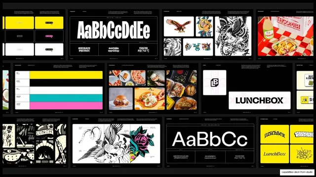
Dark contact-sheet grid of Lunchbox brand-system pages, type specimens, color bars, logo lockups, illustration plates, and food photography.
Summary
A near-black contact-sheet grid showing the Lunchbox brand system: guideline spreads for type, color, logo, illustration, and food photography laid out as small thumbnails.
Visual description
A dark slide tiled with roughly a dozen small guideline-page thumbnails, each a tiny header label plus a visual. Visible cells include color-block layout examples (yellow, pink), a large "AaBbCcDdEe" type specimen, illustration plates (eagle, rose, tattoo creatures), a checkerboard food-packaging photo, a horizontal color-bar palette (yellow/teal/pink), a tight food-photography grid (pizza, burger, dishes), a boxed "LUNCHBOX" logo lockup with monogram, black-and-white line illustrations, a second "AaBbCc" specimen, and yellow logo-graffiti plates. Hairline borders separate every thumbnail on the black ground.
Key takeaway
Compressing an entire brand book into one contact-sheet slide so the audience grasps the whole system at a glance, then can be walked through specifics. The uniform thumbnail rhythm on black makes a sprawling identity look controlled.
Reuse notes
A reusable "brand system overview" slide that summarizes guideline depth without dedicating a slide to each rule. Works for any rich identity case study. Keep thumbnails uniform and labeled. Best on a dark ground so colorful plates pop.
From this deck: Lunchbox brand system color and imagery grid
View deck





More like this





Keep what you find
A free account saves references to boards and can send you a weekly email of picks based on what you save.
To see every result, go Pro.