Preview image. Unlock full-res
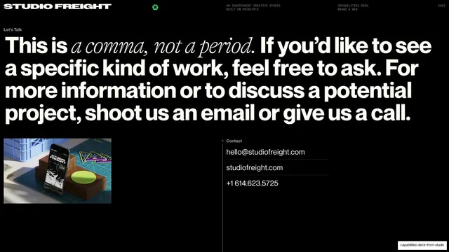
Dark closing contact slide with an oversized mixed sans-and-serif "This is a comma, not a period" statement and Studio Freight's email, site, and phone.
Summary
The closing contact slide: an oversized "This is a comma, not a period." statement mixing bold sans and serif italic, with Studio Freight's email, site, and phone, and a small branded merch photo.
Visual description
Black slide with the running header on a hairline rule (Studio Freight wordmark left, green burst glyph centered, utility labels and "2023" right). A small "Let's Talk" label sits top-left above a huge multi-line statement that fills the upper half: "This is a comma, not a period. If you'd like to see a specific kind of work, feel free to ask..." with "a comma, not a period" set in a contrasting serif italic inside the bold sans. Lower-left holds a small photo of a phone and branded coasters on a cutting mat. Lower-right, under a plus-marked "Contact" label, lists "hello@studiofreight.com", "studiofreight.com", and "+1 614.623.5725" stacked on hairline-divided rows.
Key takeaway
The "comma, not a period" line is a memorable sign-off that reframes the deck's end as an invitation. Mixing a serif italic phrase inside an oversized sans statement gives one headline two voices and marks the key clause typographically.
Reuse notes
A strong closing template for an agency or studio deck: one witty oversized statement plus a clean stacked contact block. The serif-in-sans trick needs a well-paired type duo to land. Keep the contact details on hairline rows for the same utilitarian rhythm as the rest of the deck.
From this deck: Studio Freight contact close (This is a comma, not a period)
View deck
















More like this






Keep what you find
A free account saves references to boards and can send you a weekly email of picks based on what you save.
To see every result, go Pro.