
Preview image. Unlock full-res
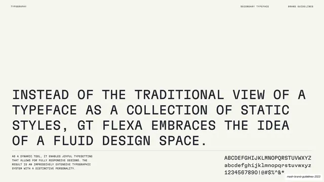
Light specimen slide with a large four-line description of the Rules typeface above a footnote paragraph and a full alphabet showing.
Summary
A Rules typeface page on cream: a large four-line statement set in the face itself describes it as a contemporary neo-grotesque rooted in Swiss Modern, over a small rationale paragraph and an upper/lowercase alphabet showing.
Visual description
Warm cream background, monospace labels "TYPOGRAPHY" left, "PRIMARY TYPEFACE" / "BRAND GUIDELINES" right. The center is dominated by a four-line headline set in Rules itself: "Rules is a contemporary interpretation of the neo grotesque font era. Rooted in Swiss Modern type inspiration and built with a strong structure in the respect of type design tradition." Below a thin rule, a small left paragraph notes Rules features modern capitals, closed terminals, an elegant twist, and reads as a neo-grotesque with an edge. At lower right, the full character set is shown in three lines: uppercase A-Z, lowercase a-z, and numerals with punctuation.
Key takeaway
Demonstrating a typeface by writing its own description in it at large size, so the specimen and the rationale are one block, then anchoring the page with a compact A-Z / a-z / 0-9 showing.
Reuse notes
A reusable primary-typeface rationale page: set the copy in the face, keep the supporting notes small, and always include a full character showing. Works for any display-capable sans with a story worth telling.
From this deck: Mash Rules typeface character and rationale
View deck





































More like this









Keep what you find
A free account saves references to boards and can send you a weekly email of picks based on what you save.
To see every result, go Pro.