Preview image. Unlock full-res
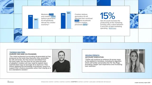
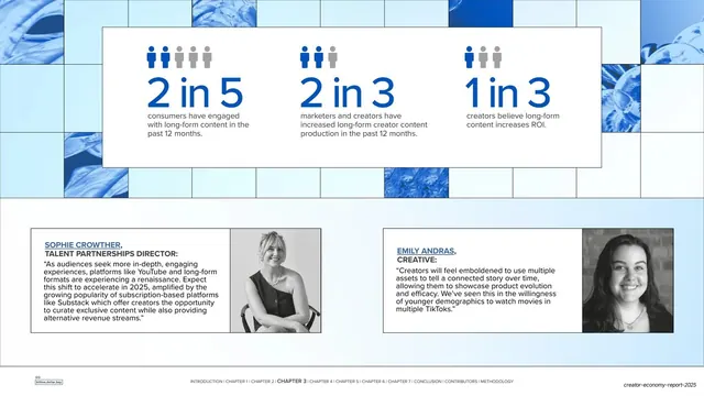
A wide data spread pairing paired-bar comparisons and a 15% pull-stat in a top white card with two attributed quote blocks and headshots below.
Summary
A data spread: a top white card holds two paired-bar comparisons and a large "15%" pull-stat, while the lower band carries two attributed expert quotes each with a small headshot.
Visual description
The slide reads as a two-page spread on a pale blue ground, with the upper area framed by a few blue abstract-texture tiles. A wide white card across the top contains two small paired-bar groups (75%/69% and 79%/82%) each labeled with short captions, and at right a large blue "15%" with supporting copy citing McKinsey. Below the card sit two bordered quote blocks side by side, each with a name and role in blue (Thomas Walters, Europe CEO and Co-founder; Helena French, Account Executive), a quotation, and a black-and-white headshot. The chapter-nav footer runs along the bottom.
Key takeaway
Stacking quantitative proof over human voices: data card on top (paired bars plus one hero stat), two named expert quotes underneath. It lets a single slide carry both the numbers and the credibility of named people. The paired-bar groups are a compact way to compare two cohorts on the same metric.
Reuse notes
Strong for a research slide that needs both statistics and expert commentary without splitting them across two pages. The two-quote band is reusable wherever you want balanced perspectives. Keep headshots black-and-white and quote cards uniform so the layout stays orderly.
From this deck: Generative AI adoption stats and quotes spread
View deck









More like this





Keep what you find
A free account saves references to boards and can send you a weekly email of picks based on what you save.
To see every result, go Pro.