Preview image. Unlock full-res
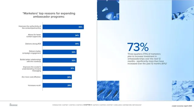
A wide data spread with a horizontal blue bar chart of marketers' reasons on the left and an oversized 73% pull-stat over pale blue tiles on the right.
Summary
A data spread: a horizontal bar chart ranking marketers' top reasons for expanding ambassador programs on the left, and a single oversized "73%" headline stat with supporting copy on the right.
Visual description
The slide reads as a two-page spread on white. The left half holds a dark grey title "Marketers' top reasons for expanding ambassador programs:" above a horizontal bar chart of eight blue bars, each ending in a white in-bar percentage (36% down to 28%), with the category labels right-aligned to the left of a single vertical axis. The right half is a pale blue panel framed at its corners by four blue abstract-texture tiles; centered in it is a very large blue "73%" with a short paragraph noting that 73% of marketers plan to increase investment in ambassadorships. The chapter-nav footer runs along the bottom.
Key takeaway
Pairing a detailed ranked bar chart with one big headline statistic, so the slide gives both the full breakdown and the single number to remember. The minimal bar styling (flat blue bars, in-bar labels, one axis line) keeps a data-dense chart calm. Corner tiles reintroduce the brand texture without crowding the stat.
Reuse notes
Ideal for a survey or research finding where you want both the ranked detail and a hero takeaway. The "chart left, big stat right" split is reusable across any data chapter. Keep the bar palette monochrome so the eye reads ranking, not categories.
From this deck: Top reasons bar chart with 73% stat spread
View deck





















More like this




Keep what you find
A free account saves references to boards and can send you a weekly email of picks based on what you save.
To see every result, go Pro.