Preview image. Unlock full-res
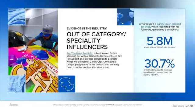
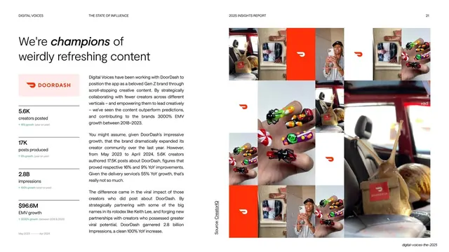
Three-zone case-study slide with a left photo grid, a center text column, and a right panel stacking two oversized blue stats.
Summary
A three-column case study: a photo grid of a creator wrapping a Candy Crush car on the left, an "EVIDENCE IN THE INDUSTRY" headline and body in the center, and two stacked oversized blue stats on the right.
Visual description
White background. The left column is a grid of square cells mixing blue fabric tiles with color photos of a creator applying a colorful Candy Crush-themed car wrap. The center column holds a small "EVIDENCE IN THE INDUSTRY:" eyebrow above a three-line bold headline "OUT OF CATEGORY/ SPECIALITY INFLUENCERS", a body paragraph, and a saturated blue square with a white outline icon. The right column, set off on a faint panel, stacks two oversized blue figures: "5.8M" with "views across his social channels" and "30.7%" with a supporting line about marketers increasing trend-based content. The usual running footer runs along the bottom.
Key takeaway
Splitting the slide into image / argument / numbers as three vertical lanes, so a reader can scan the proof, the story, and the result independently. The two stacked giant stats give a quantified payoff without a chart.
Reuse notes
A strong layout for case studies that carry more than one headline metric. Works when you have plenty of campaign imagery to fill a grid. The three-lane rhythm needs enough horizontal room; it would crowd on a narrower aspect ratio.
From this deck: Out-of-category influencers case study (Jay the Wrap Specialist)
View deck

















More like this





Keep what you find
A free account saves references to boards and can send you a weekly email of picks based on what you save.
To see every result, go Pro.