
Preview image. Unlock full-res
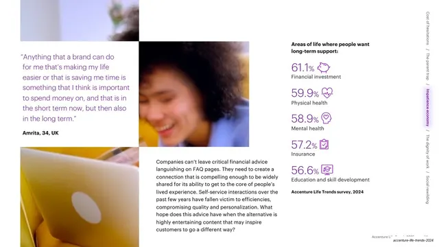
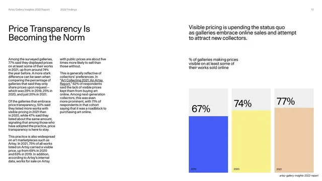
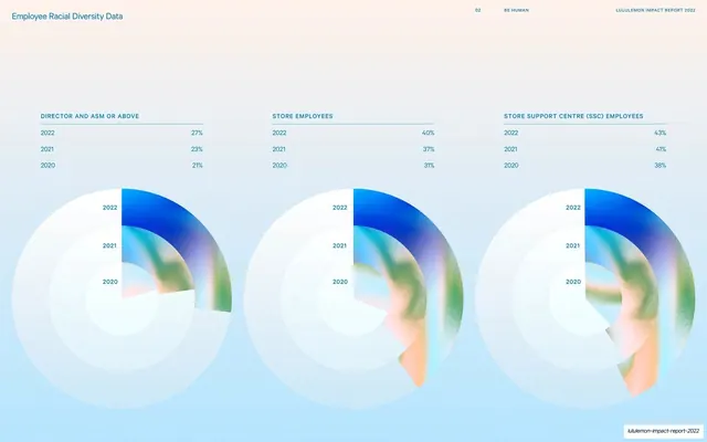
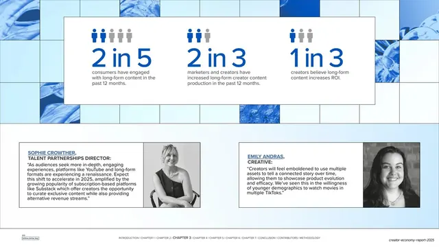
Guideline page on data visualization, with a dense specimen board of pie charts, bar charts, gauges and stat cards in brand violets.
Summary
A guideline page defining the data-visualization style, anchored by a dense specimen board mixing a hero pie chart, bar charts, circular gauges, stat cards and oversized call-out numbers, all in brand violets.
Visual description
White page, standard running header (page 58). The left column carries the "Data Visualization" headline, two intro paragraphs and a nested "Considerations" list (Cobalt, Inkwell, Mist and White as primary chart colors; large call-out numbers in DS Indigo Light Cobalt). The right two-thirds is a rounded cream board crowded with chart specimens: a large two-tone violet pie with a floating white "376 respondents" card and a "62%" pill, three labeled horizontal stacked bars, a 2x2 grid of ring gauges (NO / NEUTRAL / YES / DON'T KNOW), a row of four small stat cards (one with a mini pie, one with a dot matrix), and a stacked list of oversized percentages (37%, 12%, 7%) with captions.
Key takeaway
Showing an entire chart kit on one board so the violet/Mist palette and the oversized-number-plus-caption pattern read as a coherent family. The floating white callout card over the pie is a clean way to surface a headline stat.
Reuse notes
A reference for any report, dashboard or pitch deck that needs a restrained, on-brand data style. The discipline is the limited palette plus consistent oversized call-out numbers. Dense by design; pull individual specimens rather than copying the whole board.
From this deck: Data visualization guidance
View deck




































































































More like this





Keep what you find
A free account saves references to boards and can send you a weekly email of picks based on what you save.
To see every result, go Pro.