Preview image. Unlock full-res
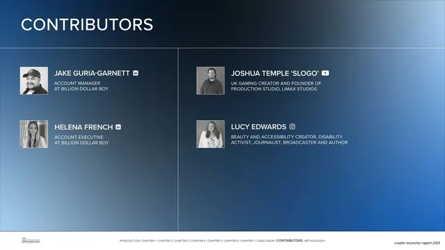
Third dark-blue contributors slide using the same two-column grid for four people, including external creator partners with platform icons.
Summary
The third contributors slide, reusing the dark two-column grid but populated with only four entries, mixing Billion Dollar Boy account staff with external creator partners.
Visual description
The same deep navy-to-blue gradient and "CONTRIBUTORS" header over a thin rule. Four entries fill the upper half of the two-column grid, leaving the lower half empty. Each pairs a square black-and-white headshot with an all-caps white name and a two-line muted-gray description. The left column lists internal staff (Account Manager, Account Executive) with LinkedIn icons; the right column lists external creator partners, "JOSHUA TEMPLE 'SLOGO'" (UK gaming creator, founder of Limax Studios) with a YouTube icon and "LUCY EDWARDS" (beauty and accessibility creator, disability activist, journalist, broadcaster, author) with an Instagram icon. The standard running footer runs along the bottom.
Key takeaway
Using the same grid to mix internal team and external collaborators, differentiating them only by the platform icon (LinkedIn vs YouTube vs Instagram). Letting a partly filled grid breathe rather than stretching four entries to fill the page.
Reuse notes
Useful when a credits page blends staff and outside contributors or partners. Swapping the trailing social icon is a lightweight way to signal someone's primary platform. Keep the empty cells empty; do not pad with filler.
From this deck: Contributors grid (accounts and creator partners)
View deck

























More like this









Keep what you find
A free account saves references to boards and can send you a weekly email of picks based on what you save.
To see every result, go Pro.