Preview image. Unlock full-res
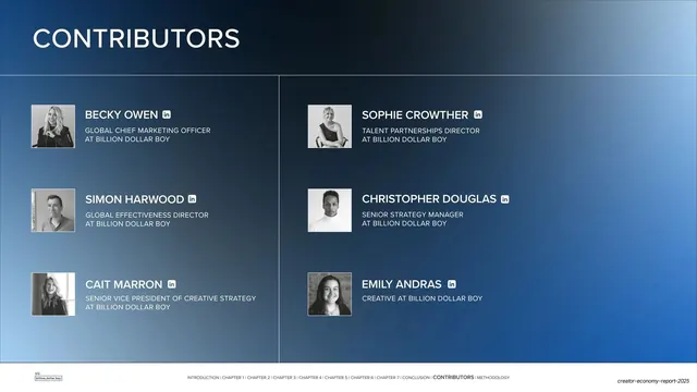
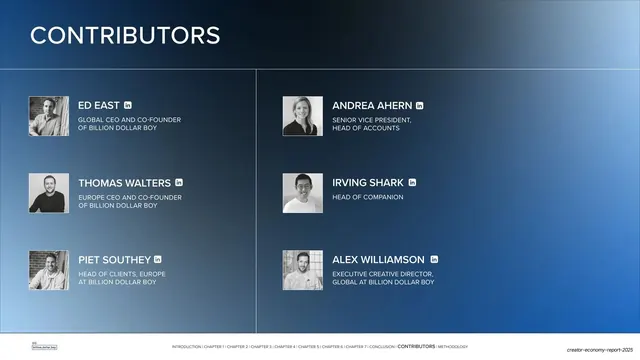
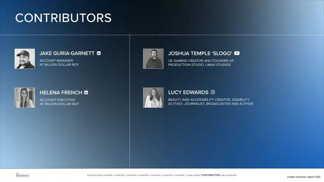
Second dark-blue contributors slide repeating the six-person, two-column headshot grid for marketing, strategy and creative staff.
Summary
The second contributors slide, reusing the same dark two-column headshot grid for six more team members across marketing, strategy, and creative roles.
Visual description
Same deep navy-to-blue gradient and layout as the prior contributors slide. A bold white "CONTRIBUTORS" title at top left over a thin full-width rule. Six entries in two columns of three: each a small square black-and-white headshot beside an all-caps white name with a LinkedIn icon, and a two-line muted-gray title (Global CMO, Talent Partnerships Director, Global Effectiveness Director, Senior Strategy Manager, SVP of Creative Strategy, Creative, all at Billion Dollar Boy). A faint vertical divider splits the columns. The standard running footer with logo, chapter breadcrumb (CONTRIBUTORS), and report slug spans the bottom.
Key takeaway
The value of repeating one team-grid template verbatim across consecutive slides: a long roster stays scannable and visually identical page to page. Consistency, not novelty, is the move.
Reuse notes
Use when a contributor or credits list exceeds one slide; clone the grid rather than redesigning. The fixed name/title/icon hierarchy and monochrome headshots keep multiple pages cohesive. Same dark-only constraint as its sibling slide.
From this deck: Contributors grid (marketing, strategy and creative)
View deck














More like this









Keep what you find
A free account saves references to boards and can send you a weekly email of picks based on what you save.
To see every result, go Pro.