Preview image. Unlock full-res
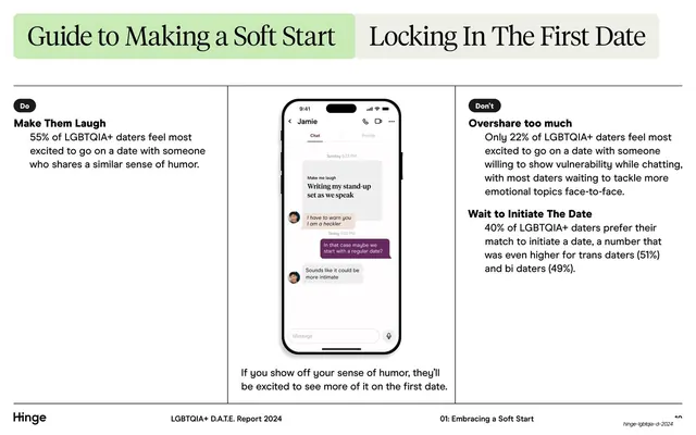
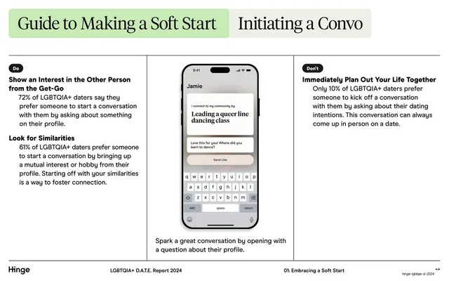
A three-column Do / Don't guide with two green-tabbed serif headers and a centered chat-screen phone mockup demonstrating profile humor.
Summary
A practical Do / Don't advice slide: two tabbed serif headers up top ("Guide to Making a Soft Start" / "Locking In The First Date"), then three columns of guidance flanking a central phone mockup of a flirty Hinge chat.
Visual description
White background. Two header tabs sit at the top in rounded soft-green panels, each holding a large serif title. A full-width hairline rule runs beneath them, broken into three columns by two thin vertical dividers. The left column carries a small black "Do" pill over bold sans subheads ("Make Them Laugh") with serif body stats; the right column mirrors it with a "Don't" pill over "Overshare too much" and "Wait to Initiate The Date". The center column shows a realistic iPhone mockup of a Hinge chat thread (Jamie, message bubbles in white and purple) with a serif caption below. The standard footer runs across the bottom: "Hinge" wordmark left, "LGBTQIA+ D.A.T.E. Report 2024" center, "01: Embracing a Soft Start" right.
Key takeaway
The Do/Don't split made legible by tiny black pill labels and a single shared phone mockup acting as the proof point in the middle. The green tabbed headers tie two related topics together without feeling like separate slides.
Reuse notes
A strong template for advice, best-practices, or onboarding content where you want a balanced two-sided comparison anchored by a real product screenshot. Needs a genuine UI mockup to carry the center. Reuse the pill-label convention for any do/don't or pros/cons layout.
From this deck: Soft start Do / Don't guide with phone mockup
View deck





More like this



Keep what you find
A free account saves references to boards and can send you a weekly email of picks based on what you save.
To see every result, go Pro.