Preview image. Unlock full-res
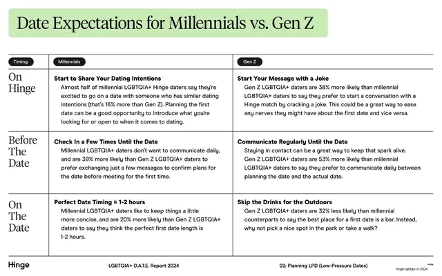
A two-column comparison table contrasting Millennial and Gen Z date expectations across three serif-labeled row stages.
Summary
A side-by-side comparison table contrasting Millennial and Gen Z LGBTQIA+ date expectations, organized into three stages with serif row labels down the left edge.
Visual description
White background. A green-tabbed serif header reads "Date Expectations for Millennials vs. Gen Z". Below a hairline, two black pill column headers ("Millennials", "Gen Z") with a small "Timing" pill anchoring the label column. Three rows follow, each separated by hairlines and titled with a large serif stage label down the left ("On Hinge", "Before The Date", "On The Date"). Within each row, two cells of bold sans subheads plus grey sans body explain each generation's behavior. The standard footer runs along the bottom: "Hinge" left, report title center, "02: Planning LPD (Low-Pressure Dates)" right.
Key takeaway
The hybrid table: serif stage labels down the side give it editorial warmth, while black pill column headers and hairline rules keep the comparison structured. It reads as a designed page, not a spreadsheet.
Reuse notes
Ideal for any A-vs-B comparison broken into stages or categories. The serif row labels plus pill headers are reusable for feature matrices, persona comparisons, or before/after tables. Keep cell copy short; three rows is about the comfortable maximum at this type size.
From this deck: Millennials vs Gen Z expectations table
View deck


More like this


Keep what you find
A free account saves references to boards and can send you a weekly email of picks based on what you save.
To see every result, go Pro.