
Preview image. Unlock full-res
A serif headline tops a three-bar column chart with gradient bars labeled 58%, 44% and 40% on a 0-100% axis.
Summary
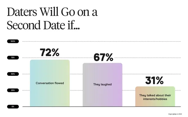
A data slide: a two-line serif headline above a three-bar gradient column chart, with big bold percentages over each bar on a pill-labeled 0-to-100% axis.
Visual description
A large two-line serif headline "Top Reasons LGBTQIA+ Daters Prefer a Soft Launch" sits top-left. Below, a column chart runs against dotted horizontal gridlines whose left edge is marked by small black pill labels (0%, 25%, 50%, 75%, 100%). Three tall rounded bars rise from the baseline, each filled with a soft pastel gradient (green, blue-violet, pink-tan) and topped by a very large bold black percentage: 58%, 44%, 40%. A short sans-serif caption sits inside each bar describing the reason. Only the small italic slug annotation appears bottom-right.
Key takeaway
Making the percentage labels oversized and the gridline ticks into small black pills turns a basic three-bar chart into a confident, branded data graphic. Placing each bar's caption inside the bar keeps labels tied to their data.
Reuse notes
A clean, reusable bar-chart treatment for three-to-five categorical figures. The pastel gradient bars match the deck's card system, keeping charts on-brand. Pull the captions out below the axis if the bars get too short to hold text.
From this deck: Top reasons to soft launch column chart
View deck


















More like this








Keep what you find
A free account saves references to boards and can send you a weekly email of picks based on what you save.
To see every result, go Pro.