Preview image. Unlock full-res
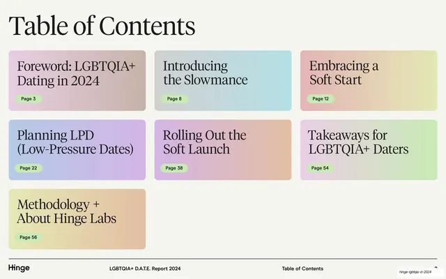
A "Table of Contents" page laying out seven section titles as soft pastel gradient cards, each with a serif heading and a green page-number pill.
Summary
The contents page: seven section titles arranged as soft pastel gradient cards in a three-column grid, each labeled with a serif heading and a green page-number pill.
Visual description
Cream background. A very large serif "Table of Contents" headline sits top-left. Below, seven rounded rectangular cards are laid out in a loose three-column grid, each filled with a different soft pastel gradient (dusty pink, pale blue, peach, periwinkle, pink-to-peach, lavender-to-green, yellow-to-peach). Each card carries a two-line section title in upright serif (Foreword, Introducing the Slowmance, Embracing a Soft Start, Planning LPD, Rolling Out the Soft Launch, Takeaways, Methodology + About Hinge Labs) and a small mint-green pill with the page number in sans. A footer rule runs the Hinge wordmark, the report title, and "Table of Contents" with a page number.
Key takeaway
Turning a contents list into a grid of colored gradient cards makes navigation feel designed rather than administrative, and the per-card gradient previews the color each section will use. The green page-number pill is a small consistent wayfinding token reused throughout the report.
Reuse notes
A reusable contents template for any multi-section report or deck. Works best when each section can be assigned its own gradient or accent so the cards double as a color key. Keep the grid loose and the type large to avoid a cramped directory feel.
From this deck: Table of Contents gradient cards
View deck















More like this






Keep what you find
A free account saves references to boards and can send you a weekly email of picks based on what you save.
To see every result, go Pro.