Preview image. Unlock full-res
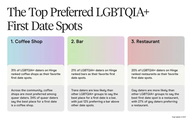
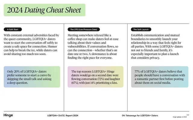
A serif title over three ranked cards (Coffee Shop, Bar, Restaurant), each with a pastel gradient header band and two stat paragraphs.
Summary
A ranked top-three slide: a large serif title over three equal columns (Coffee Shop, Bar, Restaurant), each card topped with a pastel gradient band and holding two short stat paragraphs.
Visual description
White background. The upper-left carries a two-line serif display title, "The Top Preferred LGBTQIA+ First Date Spots". Below sit three equal-width rounded cards. Each card has a tall gradient header block at the top (blue-to-lavender, green-to-grey, pink-to-grey) with a bold sans rank label ("1. Coffee Shop", "2. Bar", "3. Restaurant"). Beneath each header are two stacked light-grey panels of sans body copy giving the headline percentage and a supporting community stat. The standard footer runs along the bottom: "Hinge" left, report title center.
Key takeaway
The ranked-card pattern: identical columns differentiated only by a soft gradient header and a numbered label, with stats split into two tidy panels per card. It turns a ranking into a clean, comparable grid.
Reuse notes
Reuse for top-N lists, tiered options, or any ranked comparison where each item carries a couple of supporting facts. The gradient header bands add color without clutter; keep the body panels uniform so columns stay scannable. Scales to four columns if needed.
From this deck: Top three first date spots ranked cards
View deck


More like this






Keep what you find
A free account saves references to boards and can send you a weekly email of picks based on what you save.
To see every result, go Pro.