Preview image. Unlock full-res
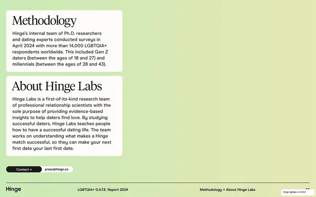
Two stacked white rounded cards on a soft green gradient, each pairing a serif header with a sans body, with a Contact press pill below.
Summary
The methodology slide: two white rounded cards stacked on the left over a green gradient, one explaining the survey method and one introducing Hinge Labs, with a contact pill beneath.
Visual description
A soft green gradient fills the slide, lightening toward the upper right. All content is left-aligned in roughly the left third. Two white rounded-corner cards stack vertically. The first card has a large black serif header "Methodology" over a short sans-serif paragraph describing the April 2024 survey of 14,000+ LGBTQIA+ respondents and the Gen Z and millennial age bands. The second, taller card uses the same serif-header / sans-body pairing for "About Hinge Labs". Below the cards sits a two-part pill: a black segment reading "Contact" with an arrow, joined to a white segment reading "press@hinge.co". A footer rule runs across the bottom with the "Hinge" wordmark left, "LGBTQIA+ D.A.T.E. Report 2024" centered, and "Methodology + About Hinge Labs" right.
Key takeaway
The serif-headline-over-sans-body card recipe, which gives a dry methodology section a piece of editorial warmth. And anchoring everything to one column over a generous empty gradient field, so a text-heavy back-matter slide still feels composed rather than crammed.
Reuse notes
A clean template for the methodology or about back-matter of any research report. The split pill (dark action label plus light value) is a tidy reusable contact component. The large empty right side invites a portrait, logo, or QR code if the slide needs more; left as-is it reads calm and confident.
From this deck: Methodology and About Hinge Labs cards
View deck

More like this



Keep what you find
A free account saves references to boards and can send you a weekly email of picks based on what you save.
To see every result, go Pro.