
Preview image. Unlock full-res
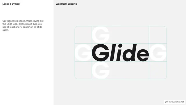
Light-grey page explaining minimum clear space using the letter "O" as the measure, with a numbered diagram of the wordmark in a dotted grid.
Summary
A clear-space page defining the logo's minimum exclusion zone using the letter "O" as the unit of measure.
Visual description
Light-grey (#F5F4F2) ground, vertical edge label. Bold "LOGO CLEAR SPACE" heading and an intro paragraph sit top-left, followed by numbered steps ("Step 1: Pick the letter 'O'... Let this be x", "Step 3: Use x as a measure from all sides..."). The right side shows a numbered diagram: a black circular badge "1" beside a grey ring (the "O"), and a black "2" beside the wordmark enclosed in a thin rectangle with a dotted construction grid and small "x" markers labeling the margins.
Key takeaway
Using a letter from the logo itself ("O") as the clear-space unit, paired with a stepped numbered diagram, the standard but well-executed way to specify an exclusion zone. The black numbered circles tie the prose steps to the diagram cleanly.
Reuse notes
A reusable clear-space / construction page for any logo guideline. The numbered-circle-to-diagram linking pattern works for any multi-step spec. Keep the dotted grid light so it reads as guidance, not part of the mark.
From this deck: Logo clear space construction
View deck

















More like this








Keep what you find
A free account saves references to boards and can send you a weekly email of picks based on what you save.
To see every result, go Pro.