Preview image. Unlock full-res
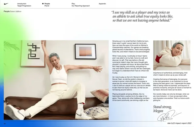
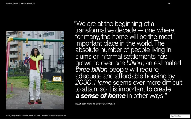
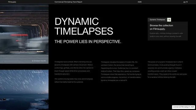
Dark report page stating a 100% pay-equity target, with body columns and two oversized 1:1 ratio figures on the left and a large campus walking photo on the right.
Summary
A target page that states a 100% pay-equity goal with a left-aligned headline and body, two oversized "1:1" ratio figures as the visual anchor, and a large daylit campus photo of two people walking on the right.
Visual description
Dark olive-green ground with the running header and a "People / Pay & Benefits" section label on hairline rules. The left column opens with a small label "Quantitative Target (Corporate)", then a two-line headline in condensed mixed-case sans ("Maintain 100% pay equity across all employee levels on an annual basis"), then three short columns of small body copy. Beside the copy, two very large "1:1" figures stack vertically, each captioned in small italic ("men/women" and "white/U.S. racial and ethnic minorities"), turning the equity metric into the slide's dominant graphic. The right half is a bright outdoor photograph of two people with backpacks walking away from camera along a brick path on a green corporate campus, with a white architectural structure behind them. Page number bottom-left.
Key takeaway
Translating an abstract policy claim (pay equity) into two oversized "1:1" ratio figures so the headline number is the hero, not buried in prose. The cool daylight campus photo balancing the warm-dark template and giving the data page air.
Reuse notes
Strong pattern for any report page built around a single headline ratio or parity metric. Set the ratio figure as large as the headline so the eye lands on it first. Works best when the metric is genuinely a clean ratio; messier numbers lose the impact.
From this deck: Pay equity quantitative target page
View deck