Preview image. Unlock full-res
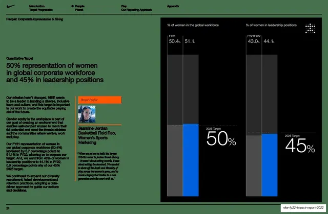
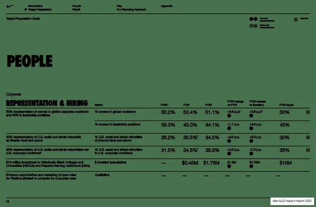
Data slide pairing a left target statement and profile card with a large near-black panel holding two FY21-to-FY22 bar charts and oversized white target percentages.
Summary
A quantitative-target data slide: the left side states the 50% women-representation goal with supporting copy and a "People Profile" card; the right side is a near-black panel with two side-by-side bar charts comparing FY21 to FY22 and giant white "2025 Target" percentages.
Visual description
The left half is sage-green. A small "Quantitative Target" label tops a medium sans headline ("50% representation of women in global corporate workforce and 45% in leadership positions"), followed by several short body paragraphs and an orange-tabbed "People Profile" card with a small headshot, name (Jasmine Jordan), title, and an italic quote. The right half is a tall near-black rectangle containing two grouped bar comparisons: "% of women in the global workforce" (FY21 50.4% vs 51.1%) and "% of women in leadership positions" (43.0% vs 44.1%), drawn as dark-grey and bright-blue bars, each annotated with an oversized white "2025 Target" figure (50%, 45%). A small dotted-square mark sits top-right. Nike running header on top; page 21 bottom-left.
Key takeaway
The split of narrative-left / data-right, where the data lives in a single dark panel so the charts read as one confident block. Pairing each chart with one oversized target number makes the goal legible at a glance, and the lone blue bar against greyscale focuses the eye on the latest result.
Reuse notes
A clean pattern for impact, ESG, or DEI reporting where each metric has a target and a year-over-year comparison. Reusable as a fixed template across many KPI slides. The dark panel plus single accent color keeps dense data calm; swap the accent to match brand. The embedded profile card is a nice way to humanize a stats page.
From this deck: 50% women representation quantitative target with bar charts
View deck


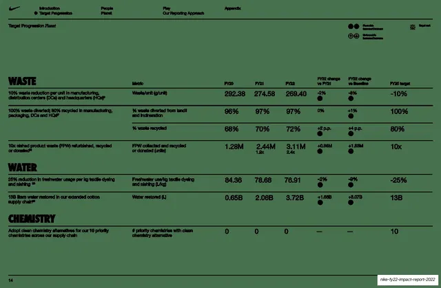
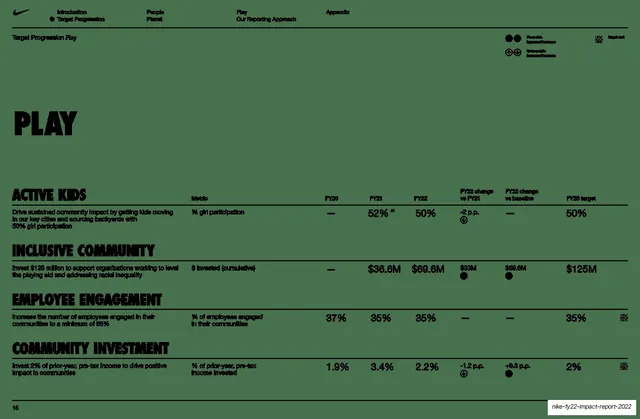
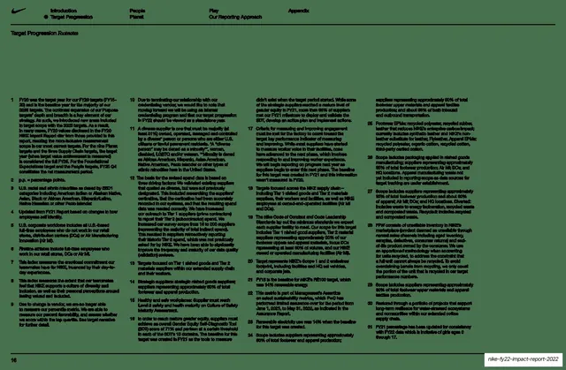
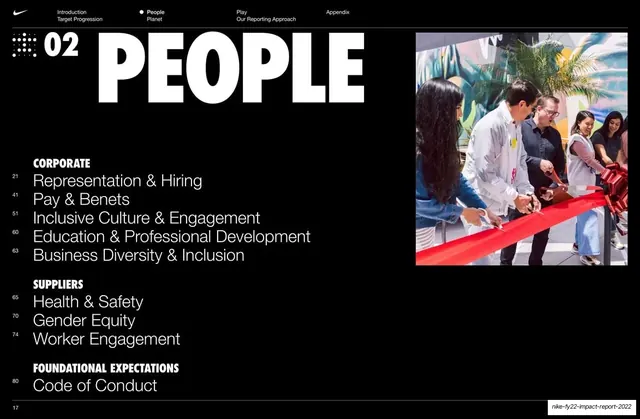




More like this




Keep what you find
A free account saves references to boards and can send you a weekly email of picks based on what you save.
To see every result, go Pro.