
Preview image. Unlock full-res
A 19-slide investor earnings deck that pairs full-bleed warm lifestyle photography section dividers with restrained lavender-accented charts and tables, all in a grotesque sans on Sonos brand colors.
Summary
A 19-slide quarterly earnings presentation from Sonos reporting Q2 FY2022 results. Its personality comes from alternating registers: full-bleed warm lifestyle product photography for the section dividers, then quiet data slides where a single chart or table is the only color event, all held together by the Sonos brand palette and one grotesque sans.
Visual description
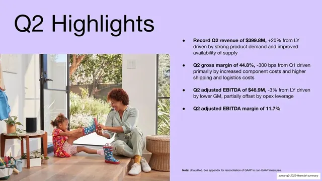
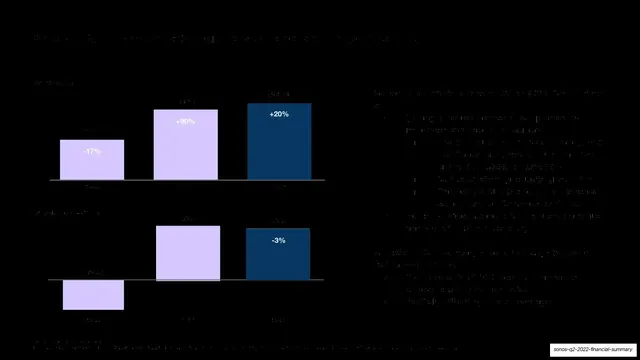
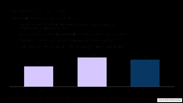
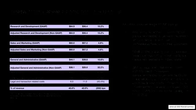
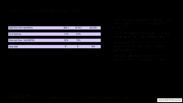
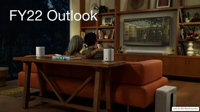
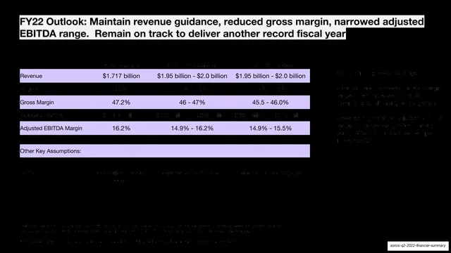
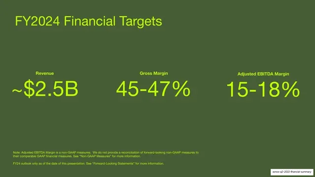
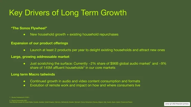
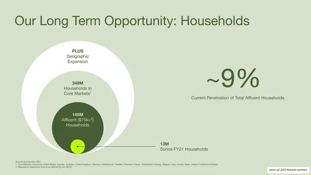
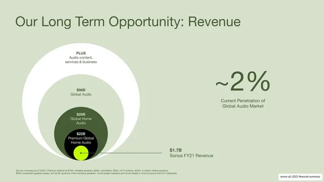
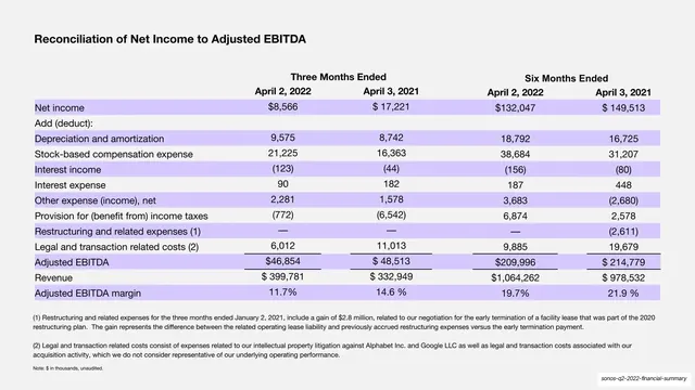
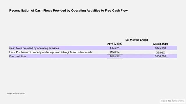
Slides run 16:9. The deck cycles through a small set of brand backgrounds rather than one fixed template: soft lavender/periwinkle, olive-green, near-black, and light grey. Type is a single Helvetica-style grotesque sans; headlines are large, mixed-case, and left-aligned to the top of the slide ("Q2 Highlights", "FY22 Outlook", "Long Term Opportunity"). The recurring grammar has three modes. First, photographic section dividers: a full-bleed warm Sonos lifestyle photo (people with speakers at home, cooking, watching TV) with a single large headline dropped into a top corner in white. Second, data slides on near-black or olive grounds where bar charts and financial tables are rendered in a restrained two-tone of pale lavender and deep navy bars, with results tables striped in alternating lavender and transparent rows. Third, big-number summary slides where three oversized figures ("~$2.5B", "45-47%", "15-18%") sit in a row in lime-green on olive. A lime-green dot recurs as the "Sonos today" marker inside nested-circle market-opportunity diagrams. The cover places the title top-left in black on lavender with a vertical "SONOS" wordmark up the right edge and a product photo bleeding off the lower-left; the deck closes on the SONOS wordmark centered on lavender. Two dense legal/disclaimer slides and a reconciliation appendix run as small body copy.
Key takeaway
The discipline of letting brand photography carry the emotional slides and brand color carry the data slides, so the deck feels like the product without decoration. The two-tone lavender/navy chart palette keeps every chart on-brand and instantly legible. And the nested-circle TAM diagram with a tiny lime dot for "us today" is a clean, reusable way to show a small current share inside a huge opportunity.
Reuse notes
A strong reference for investor and earnings decks, especially for consumer-hardware or design-led brands that already own a distinctive palette and a photo library. The three-mode rhythm (photo divider, data slide, big-number slide) is directly reusable to pace any quarterly or annual report. Needs genuinely good brand photography to carry the dividers and a tight color system so the data slides stay restrained. The dark navy data slides run low-contrast; bump the text weight or lighten the ground if accessibility matters.
From this deck: Sonos Q2 2022 Financial Summary
View deck




More like this




Keep what you find
A free account saves references to boards and can send you a weekly email of picks based on what you save.
To see every result, go Pro.