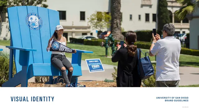
Preview image. Unlock full-res
A 28-page university brand guideline in Founders Blue and white, pairing a condensed all-caps sans for section headers with a Spectral serif for subheads across a strict two-column text-and-examples grammar.
Summary
The University of San Diego brand guideline, a 28-page document in Founders Blue and white that codifies a deep logo-and-marks system, a blue-led color palette, and a Sophia Sans plus Spectral type pairing. Its defining feature is a disciplined two-column grammar that keeps every topic to running text on the left and labeled visual examples on the right.
Visual description
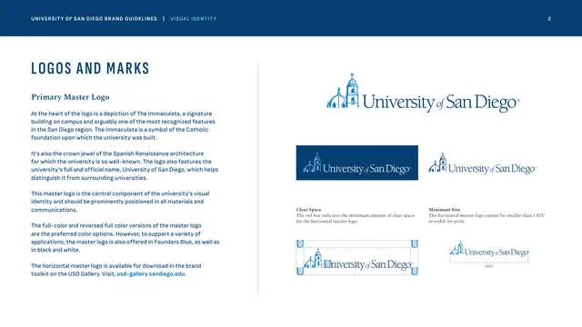
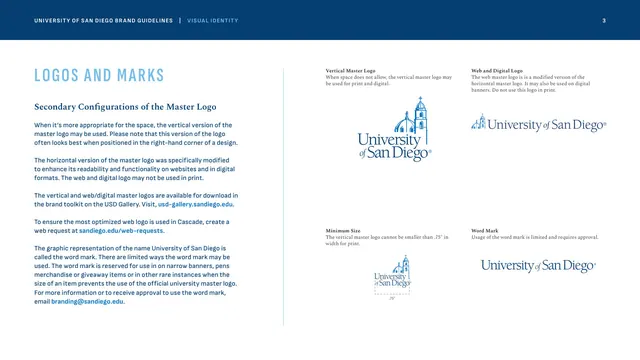
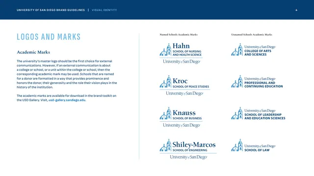
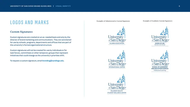
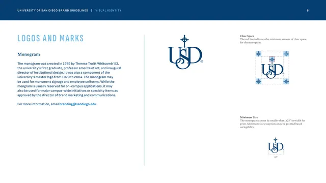
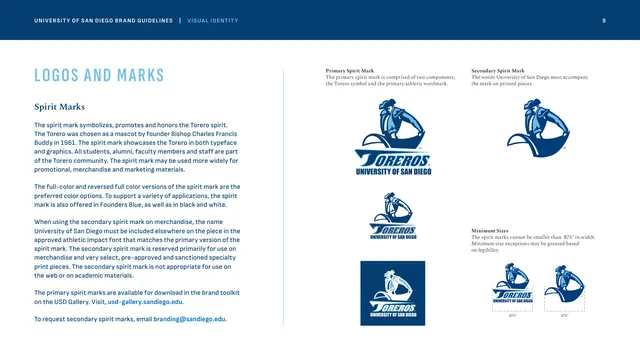
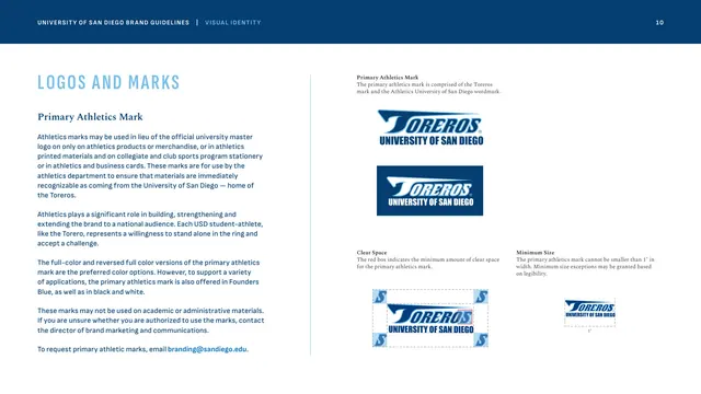
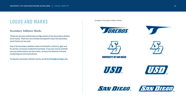
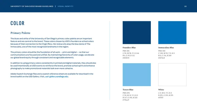
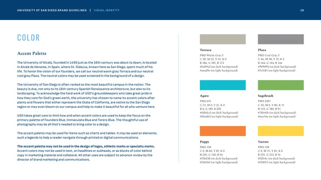
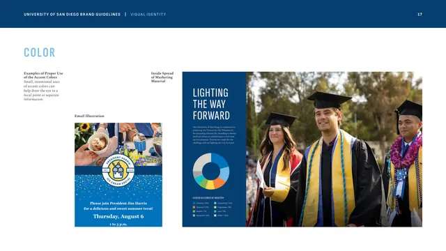
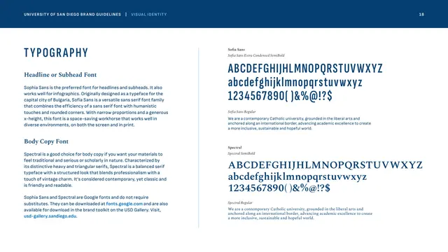
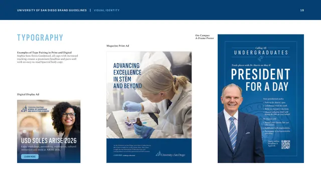
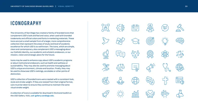
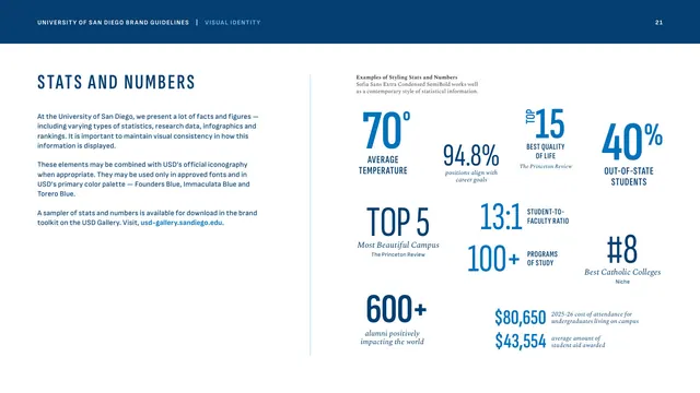
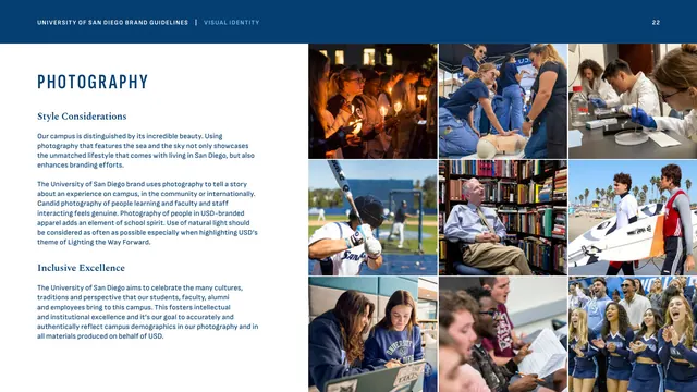
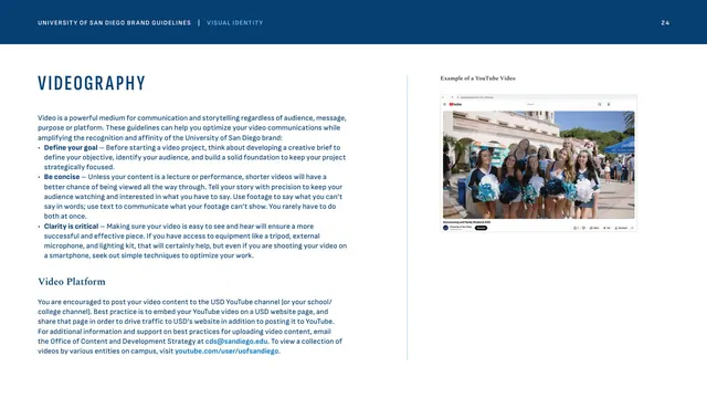
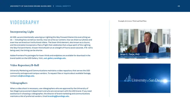
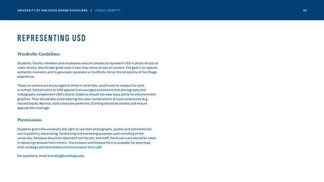
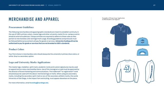
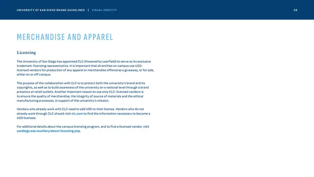
A light, restrained system. Every interior page opens with a slim Founders Blue (#003b70) header band carrying "UNIVERSITY OF SAN DIEGO BRAND GUIDELINES" in white tracked caps, a pale-blue "VISUAL IDENTITY" tag, and the page number at the right. Below, content sits on white in two columns separated by a thin pale-blue vertical rule: section titles set in a condensed, widely tracked all-caps sans (Sophia Sans Extra Condensed) in Founders Blue, a Spectral serif subhead, and Sophia Sans body copy with links called out in bright Immaculata Blue. The right column holds logo lockups, swatches, type specimens, icon grids, stat treatments, or photo grids, each captioned in small serif italics. The cover breaks the band rule with a full-bleed campus photograph (a student in an oversized sky-blue Adirondack chair) and a bottom white strip reading "VISUAL IDENTITY" beside "UNIVERSITY OF SAN DIEGO BRAND GUIDELINES." The palette is overwhelmingly blue on white: Founders Blue, Immaculata Blue, and Torero Blue, with warm and cool grays plus six saturated accent colors reserved for charts and infographics. Photography is candid, sunlit, and campus-centric.
Key takeaway
The two-column "text left, evidence right" template that scales across every chapter without redesign, held together by one thin vertical rule and a fixed header band. The type pairing of a tightly tracked condensed all-caps sans for section labels against a classic triangular-serif (Spectral) subhead reads both contemporary and institutional. The restraint of an almost entirely blue-and-white system, with bright accent colors deliberately quarantined to data, keeps a sprawling identity coherent.
Reuse notes
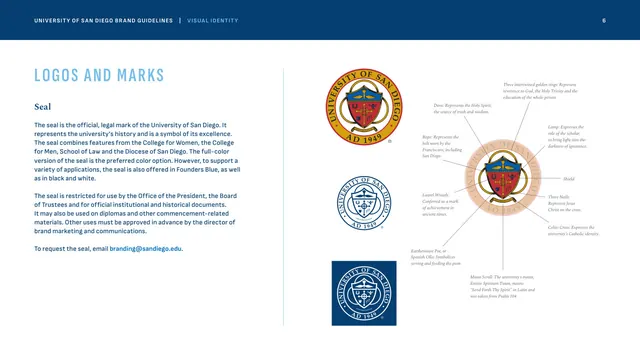
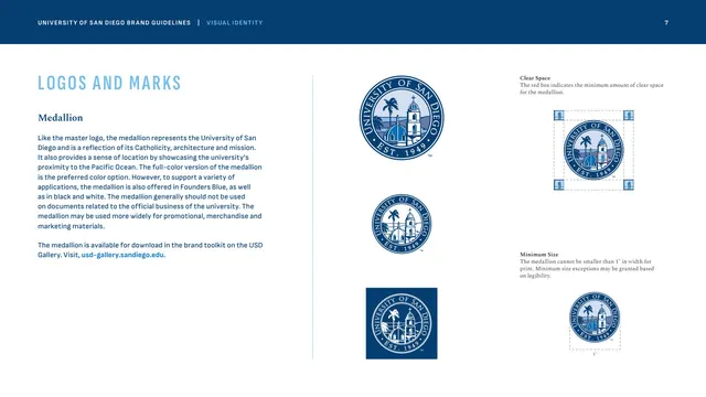
A strong reference for any large institutional or higher-education identity system that must document many marks (master logo, academic marks, seal, medallion, monogram, spirit and athletics marks) without visual fatigue. The fixed-band, two-column structure is ideal when one template has to carry logo rules, color, type, photography, and merchandise sections side by side. Best paired with strong candid photography to warm up the otherwise reserved blue-on-white pages.
From this deck: University of San Diego Visual Identity Guidelines
View deck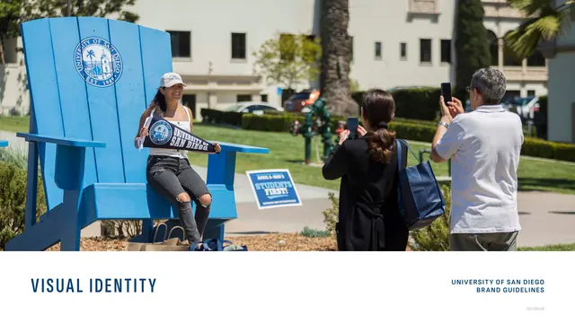

More like this






Keep what you find
A free account saves references to boards and can send you a weekly email of picks based on what you save.
To see every result, go Pro.